Chapter 3 Multiple Regression
This chapter covers material from chapters 9-12 of Sleuth.
3.1 The variables
Suppose we have a quantitative response variable \(y\) that we want to relate to \(p\) explanatory variable (aka predictors, covariates) \(x_1, \dotsc, x_p\). There is no restriction on the type of covariates, they can be both quantitative and categorical variables.
3.2 The model form
This section describes the multiple linear regression (MLR) model for a particular population of interest. Another way to frame the model is that it describes a hypothetical data generating process (DGP) that was used to generate the sample of data that we have on hand.
The major change in the MLR model compared to the SLR model is that now the mean function \(\mu_{y\mid x_1, \dotsc, x_p}\) is a function of all covariates. The expression for \(\mu\) must be linear with respect to the \(\beta\) parameters even if we used a function of a predictor like \(\log(x)\). The expression for \(\mu\) is can even involve polynomial functions of \(x\) like \(x^2\) or interactions of predictors like \(x_1 \times x_p\). In this section, we will describe the basic MLR with the simplest form it can take: \[ \mu_{y\mid x_1, \dotsc, x_p} = \beta_0 + \beta_1 x_{1,i} + \beta_2 x_{2,i} + \dotsm \beta_p x_{p,i} \] More complicated forms will be described later in this chapter.
Let \(Y_i\) be the response from unit \(i\) that has explanatory (aka predictor) values \(x_{1,i}, x_{2,i}, \dotsc, x_{p,i}\). There are two equivalent ways to express the SLR model for \(Y\):
Conditional normal model: \[ Y_i \mid x_{1,i}, x_{2,i}, \dotsc, x_{p,i}\sim N(\mu_{y\mid x} = \beta_0 + \beta_1 x_{1,i} + \beta_2 x_{2,i} + \dotsm \beta_p x_{p,i}, \sigma) \]
Mean + error: \[\begin{equation} Y_i = \beta_0 + \beta_1 x_{1,i} + \beta_2 x_{2,i} + \dotsm \beta_p x_{p,i} + \epsilon_i \ \ \ \ \ \epsilon_i \sim N(0, \sigma) \end{equation}\]
Both expressions of the MLR model above say the same thing:
- Linear Mean: \(\mu_{y\mid x}\) describes the population mean value of \(Y\) given all predictor values and it is linear with respect to the \(\beta\) parametrs. (We still have a “linear” model even if we used \(\log(x)\) or \(x^2\)!)
- Constant SD: \(SD(Y\mid x)=\sigma\) describes the SD of \(Y\)’s in the population around a given mean value \(\mu_{y\mid x}\). The fact that this SD does not depend on the value of \(x\) is called the contant variance, or homoscedastic, assumption.
- Normality: The shape of population response values around \(\mu_{y\mid x}\) is described by a normal distribution model.
- Indepedence: Given a predictor value of \(x\), all responses \(Y\) occur independently of each other.
There are a total of \(\pmb{p+1}\) parameters in this MLR model:
- the \(p\) mean parameters \(\beta_0, \beta_1, \dotsc, \beta_p\)
- the SD parameter \(\sigma\)
3.2.1 Interpretation
How a predictor influences the mean response is determined by the form of the \(\mu\) function. Some common forms are discussed here.
3.2.1.1 Planar model
The mean model described above models the relationship between \(y\) and all corvariates as a \((p+1)-\)dimensional plane: \[ \mu_{y\mid x_1, \dotsc, x_p} = \beta_0 + \beta_1 x_{1} + \beta_2 x_{2} + \dotsm \beta_p x_{p} \] When \(p=1\), we have a SLR and this “plane” simplifies to a 2-d line. When \(p=2\), the mean “surface” is a 3-D plane. The plot below displays an example of a sample of point triples \((x_{1,i}, x_{2,i}, y_i)\) that form a point “cloud” that is floating in the x-y-z coordinate system. The mean function is a plane that floats through the “middle” of the point cloud, hitting the mean value of \(y\) for each combination of \(x_1\) and \(x_2\). Notice that when we “fix” one of the predictor values, the trend between \(y\) and the other predictor is linear. E.g. Pick any place on the mean surface, then any place you “trace” along the surface will result in a line.
How should we interpret the \(\beta\)’s in our planar mean function?
- \(\beta_0\) is the mean response when all predictor values are 0 since \(\mu_{y \mid 0} = \beta_0 + \beta_1(0) + \dotsm + \beta_p (0)= \beta_0\).
- \(\beta_j\) tells us how the mean response changes for a one unit increase in \(x_j\) holding all other predictors fixed. We can illustrate this for the the predictor \(x_1\). The mean function at \(x_1 + 1\), holding \(x_2, \dotsc, x_p\) fixed, is \[ \begin{split} \mu(y \mid x_1+1, x_2, \dotsc, x_p) &= \beta_0 + \beta_1 (x_{1}+1) + \beta_2 x_{2} + \dotsm + \beta_p x_p \\ & = \beta_0 + \beta_1 x_{1} + \beta_1 + \beta_2 x_{2} + \dotsm + \beta_p x_p \\ & = \mu(y \mid x_1, x_2, \dotsc, x_p) + \beta_1 \end{split} \] This shows that a 1 unit increase in \(x_1\) is associated with a \(\beta_1\) change in the mean response holding all other predictors fixed. This holds in general too: a 1 unit increase in \(x_j\) is associated with a \(\beta_j\) change in the mean response holding all other predictors fixed.
3.2.1.2 Quadratic model
A model that incorporates polynomial functions of predictors, like \(x^2, x^3\), etc, is also a MLR model. Here is an example that says the mean of \(y\) is a quadratic function of \(x_1\) but a linear function of \(x_2\): \[ \mu_{y\mid x_1, x_2} = \beta_0 + \beta_1 x_{1} + \beta_2 x_{1}^2 + \beta_3 x_{2} \] Notice that this model has two covariates \(x_1\) and \(x_2\) but four mean function parameters \(\beta_0 - \beta_4\) due to the extra quadratic term. An example of this model is visualized below (with all \(\beta\)’s equal to 1). You see the quadratic relationship with \(x_1\) when you orient the \(x_1\) axis to be the left-to-right axes with the \(x_2\) axis coming out of the page. When these axes are flipped, you see a linear relationship.
How should we interpret the \(\beta\)’s in this quadratic mean function?
- \(\beta_0\) is the mean response when all predictor values are 0.
- \(\beta_3\) tells us how the mean response changes for a one unit increase in \(x_2\) holding \(\pmb{x_1}\) fixed.
- \(\beta_1\) and \(\beta_2\) tell us how the mean response changes as a function of \(x_1\), but since it is quadratic the exact change in the mean response depends on the value of \(x_1\). E.g. the closer the \(x_1\) value is to the “top” or “bottom” of the quadratic curve, the smaller the changes in the mean response. We can illustrate this for the the predictor \(x_1\). The mean function at \(x_1 + 1\), holding \(x_2\) fixed, is \[ \begin{split} \mu(y \mid x_1+1, x_2) &= \beta_0 + \beta_1 (x_{1}+1)+ \beta_2 (x_{1}+1)^2 + \beta_3 x_{2} \\ & = \beta_0 + \beta_1 x_{1} + \beta_1 + \beta_2 x_{1}^2 + \beta_2 2x_1 + \beta_2 + \beta_3 x_2 \\ & = \mu(y \mid x_1, x_2) + \beta_1 + \beta_2(2x_1+1) \end{split} \] This shows that a 1 unit increase in \(x_1\) is associated with a \(\beta_1 + \beta_2(2x_1+1)\) change in the mean response holding all other predictors fixed. For example, if \(x_1 = 1\) the mean change is \(\beta_1 + 3\beta_2\).
3.2.1.3 Interactions
A model that incorporates predictor interactions says that the effect of one predictor is dependent on the value of the other predictor, and vica versa. Here is an example that has the interaction of \(x_1\) and \(x_2\): \[ \mu_{y\mid x_1, x_2} = \beta_0 + \beta_1 x_{1} + \beta_2 x_{2} + \beta_3 x_1x_{2} \] An example of this model is visualized below (with all \(\beta\)’s equal to 1). We obviously don’t see a planar surface. It’s a bit hard to see, but any “slice” you take from the surface along the \(x_1\) axis will create a linear function along the \(x_2\) axis. The trend, or steepness, of this line depends on the value you chose for \(x_1\). Switching the \(x_1\) and \(x_2\) variables results in the same observation. The effect of each predictor is linear, but its slope, or effect size, is a function of the other predictor.
How should we interpret the \(\beta\)’s in this interaction mean function?
- \(\beta_0\) is the mean response when all predictor values are 0.
- \(\beta_1\) tells us how the mean response changes for a one unit increase in \(x_1\) when \(\pmb{x_2=0}\).
- \(\beta_2\) tells us how the mean response changes for a one unit increase in \(x_2\) when \(\pmb{x_1=0}\).
- \(\beta_3\) is the interaction effect that tells us how the effect of \(x_1\) varies as a function of \(x_2\), and vice versa. We can illustrate this for the the predictor \(x_1\). The mean function at \(x_1 + 1\), holding \(x_2\) fixed, is \[ \begin{split} \mu(y \mid x_1+1, x_2) &= \beta_0 + \beta_1 (x_{1}+1)+ \beta_2 x_2+ \beta_3 (x_1+1)x_{2} \\ & = \beta_0 + \beta_1 x_{1} + \beta_1 + \beta_2 x_{2} + \beta_3x_1x_2 + \beta_3x_2 \\ & = \mu(y \mid x_1, x_2) + \beta_1 + \beta_3x_2 \end{split} \] This shows that a 1 unit increase in \(x_1\) is associated with a \(\beta_1 + \beta_3x_2\) change in the mean response holding all other predictors fixed. For example, if \(x_2 = 5\) the mean change is \(\beta_1 + 5\beta_3\). Similary, a 1 unit increase in \(x_2\) is associated with a \(\beta_2 + \beta_3x_1\) change in the mean response holding all other predictors fixed.
3.3 Example: MLR fit and visuals
3.3.1 lm fit
We fit a MLR model in R using the same command as a SLR model, but we add model predictors on the right-hand side of the formula. Examples include:
- planar model:
lm(y ~ x1 + x2 + x3, data=, subset=) - interaction model:
lm(y ~ x1 + x2 + x1:x2 + x3, data=, subset=)orlm(y ~ x1*x2 + x3, data=, subset=) - quadratic model:
lm(y ~ x1 + I(x1^2) + x2, data=, subset=). This uses the “as is” operatorI()that tells R that^is interpreted as a power rather than as its symbolic use in a formula (see?formulafor more details)
Here is the multiple linear regression of brain weight (g) on gestation (days), body size (kg) and litter size from Case Study 9.2:
library(Sleuth3)
brain <- case0902
brain_lm <- lm(Brain ~ Gestation + Body + Litter, data = brain )
brain_lm
##
## Call:
## lm(formula = Brain ~ Gestation + Body + Litter, data = brain)
##
## Coefficients:
## (Intercept) Gestation Body Litter
## -225.2921 1.8087 0.9859 27.6486The estimated mean function is \[ \hat{\mu}(brain \mid gest,body,litter) = -225.2921 + 1.8087 Gestation + 0.9859 Body + 27.6486 Litter \] Holding gestation length and body weight fixed, increasing litter size by one baby increases estimated mean brain weight by 27.6g. But is this an appropriate model to use? This interpretation is meaningless if the model doesn’t fit the data! We need to check this with scatterplots and residual plots.
3.3.2 Graphics for MLR
If we have \(p\) predictors in our model, then the MLR model can be viewed in a (at least) \(p\)-dimensional picture! Viewing this is difficult, if not impossible. The best we can do is look at 2-d scatterplots of \(y\) vs. all the predictor variables. (But, unfortunately, what we see in these 2-d graphs doesn’t always explain to us what we will “see” in the MLR model.)
3.3.2.1 Scatterplot matrix
A scatterplot matrix plots all pairs of variables used in a model. The primary plots of interest will have the response \(y\) on the y-axis and the predictors on the x-axis. But the predictor plots (e.g. \(x_1\) vs. \(x_2\)) are useful to see if any predictors are related, which is a topic discussed in more detail later in these notes.
The basic scatterplot matrix command pairs takes in a data frame, minus any columns you don’t want plotted:
## [1] "Species" "Brain" "Body" "Gestation" "Litter"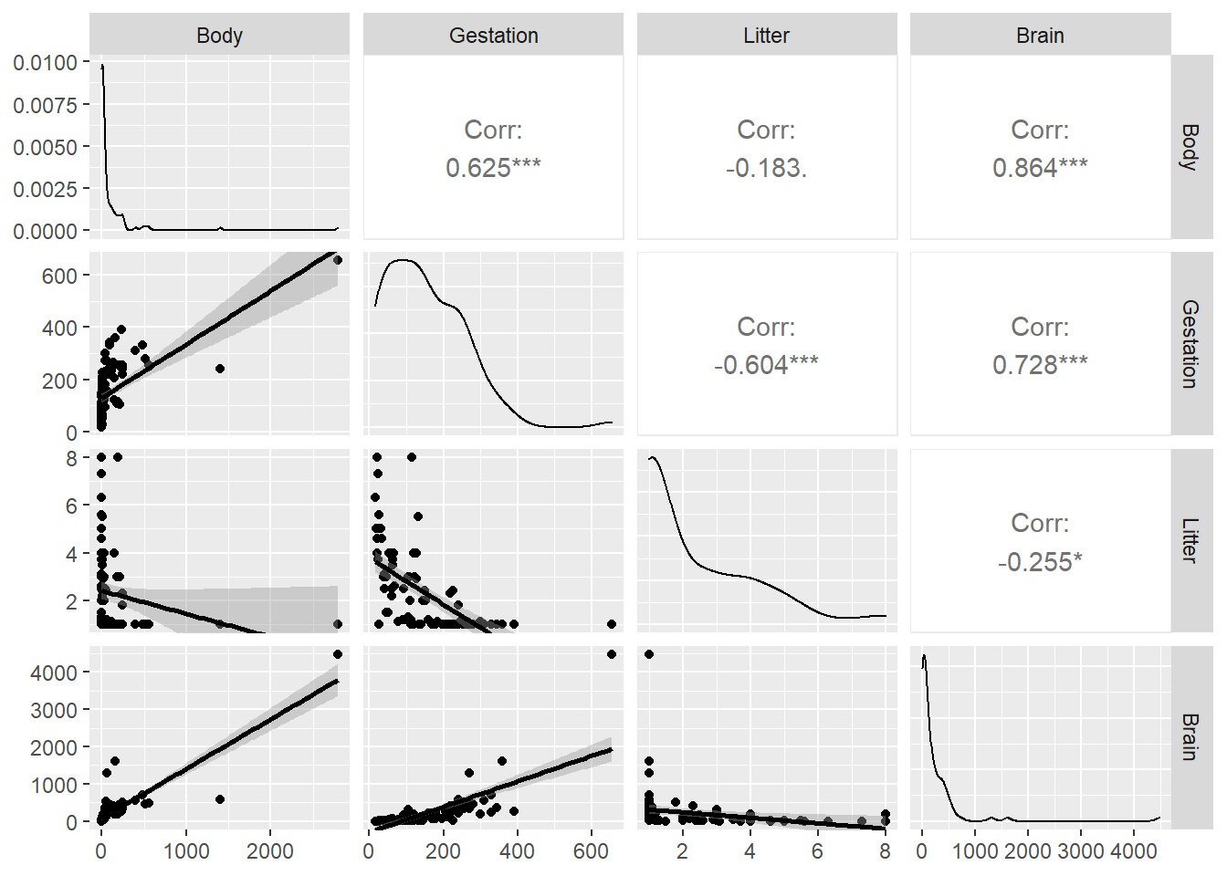
The top row shows scatterplots of the response Brain vs. the three predictors. All three indicate that transformations of all variables should be explored.
A slightly nicer version that includes univariate density curves and correlation coefficients is made using ggpairs in the GGally package. This option fits a smoother curve to the scatterplots:
library(GGally)
ggpairs(brain,
        columns = c("Body","Gestation", "Litter","Brain"),
        lower = list(continuous = "smooth"))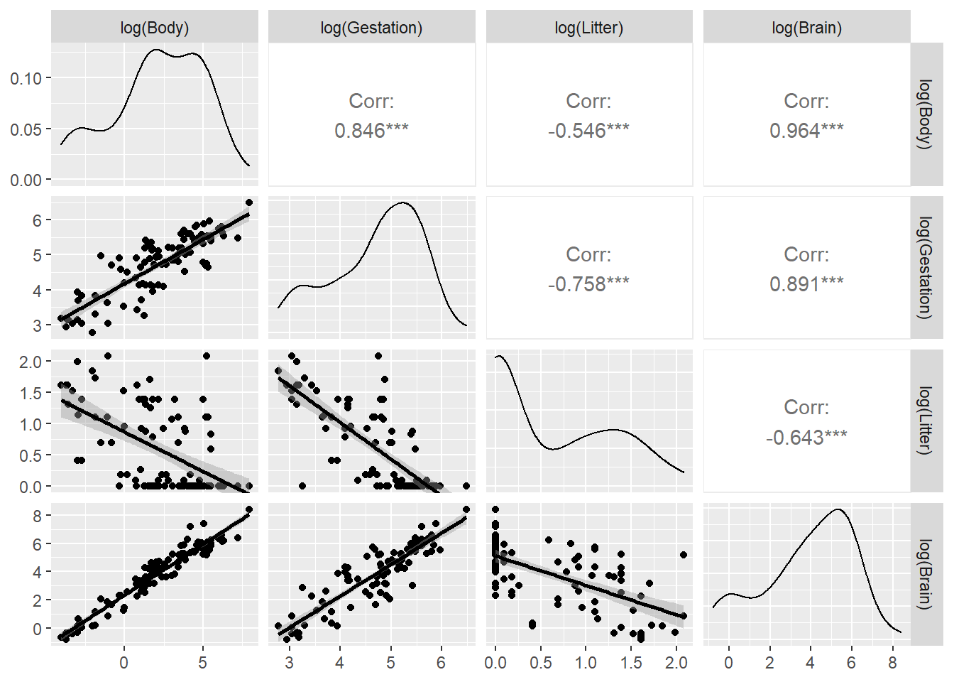
In this plot command, we select variables from brain in the columns argument with the response Brain listed last to make the lower row of the plot show the response Brain on the y-axis vs. all three predictors on the x-axes.
Conclusion: transformations are likely needed. Since all variables have positive values, we can try logs first.
We can’t use a scale argument in a scatterplot matrix to explore transformations. Instead, we can use the dplyr package to transform all variables (except Species) using the mutate_all function, then we plot using ggpairs again. Here we also added the ggpairs argument columnLabels to remind us what transformations were made:
library(dplyr)
brain %>%
  select(-Species) %>%  # omit species
  mutate(across(.fns = log)) %>%  # apply the log function across all variables
  ggpairs(columns = c("Body","Gestation", "Litter","Brain"),
          lower = list(continuous = "smooth"),
          columnLabels = c("log(Body)","log(Gestation)", "log(Litter)","log(Brain)"))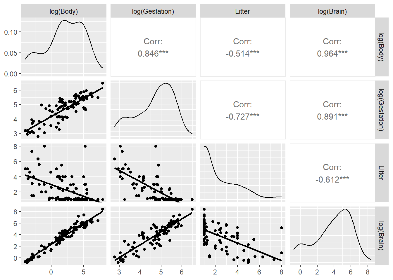
Does Litter need to be logged? If we don’t want to log all variables, we can use mutate_at instead of mutate_all:
brain %>%
  select(-Species) %>%  # omit species
  mutate(across(.cols = c(Brain, Body, Gestation), .fns = log)) %>%  # pick columns to log
  ggpairs(columns = c("Body","Gestation", "Litter","Brain"),
          lower = list(continuous =  wrap("smooth", se = FALSE)),
          columnLabels = c("log(Body)","log(Gestation)", "Litter","log(Brain)"))
3.3.2.2 Jittered scatterplot:
Jittered plots are useful when data points overlap (discrete variables like litter) and your sample size isn’t huge. Change the alpha transparency value with large data sets. Here we compare geom_point() against geom_jitter, using grid.arrange from the gridExtra package to put these plots side-by-side:
base <- ggplot(brain, aes(x=Litter, y=Brain)) + scale_y_log10()
plotA <- base + geom_point() + labs(title="unjittered")
plotB <- base + geom_jitter(width=.1) + labs(title="jittered")
library(gridExtra)
grid.arrange(plotA,plotB, nrow=1)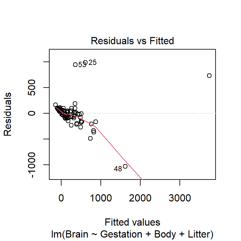
The width=.1 amount specifies how much to jitter the points (we changed it here because the default amount didn’t display enough of a change). We can see the jittering most in the points clustered around Litter=0.
3.3.3 Residual plots for MLR
If we have \(p\) predictors, then there are \(p+1\) residual plots to check:
- plot \(r_i\) against all predictors \(x_1, \dotsc, _p\). The motivation for these plots is the same as SLR (residuals should not be related to the \(x\)’s)
- plot \(r_i\) against the fitted values \(\hat{y}_i\). The motivation for this may be less clear, but the fitted values are simply a linear function of the predictor values: \[ \hat{y}_i = \hat{\beta}_0 + \hat{\beta}_1 x_{1,i} + \hat{\beta}_2 x_{2,i} + \dotsm + \hat{\beta}_p x_{p,i} \] so the residuals should not be related to the fitted values if the model fits.
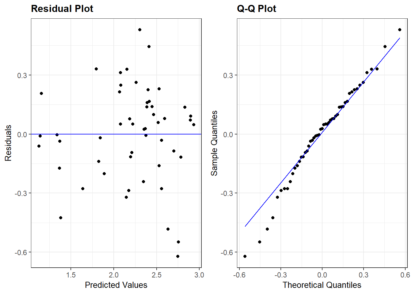
All \(p+1\) plots should be checked. A quick starting point is the fitted value plot which is the first plot when plot-ing the lm. Here is the residuals vs. fitted plot for the untransformed variable model:
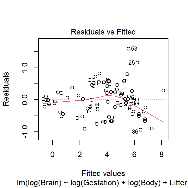
This plot indicates non-linearity and non-constant variance. Here is the same residual plot for the model will all variables logged except Litter:
brain_lm2 <- lm(log(Brain) ~ log(Gestation) + log(Body) + Litter,
                data=brain)
plot(brain_lm2, which=1)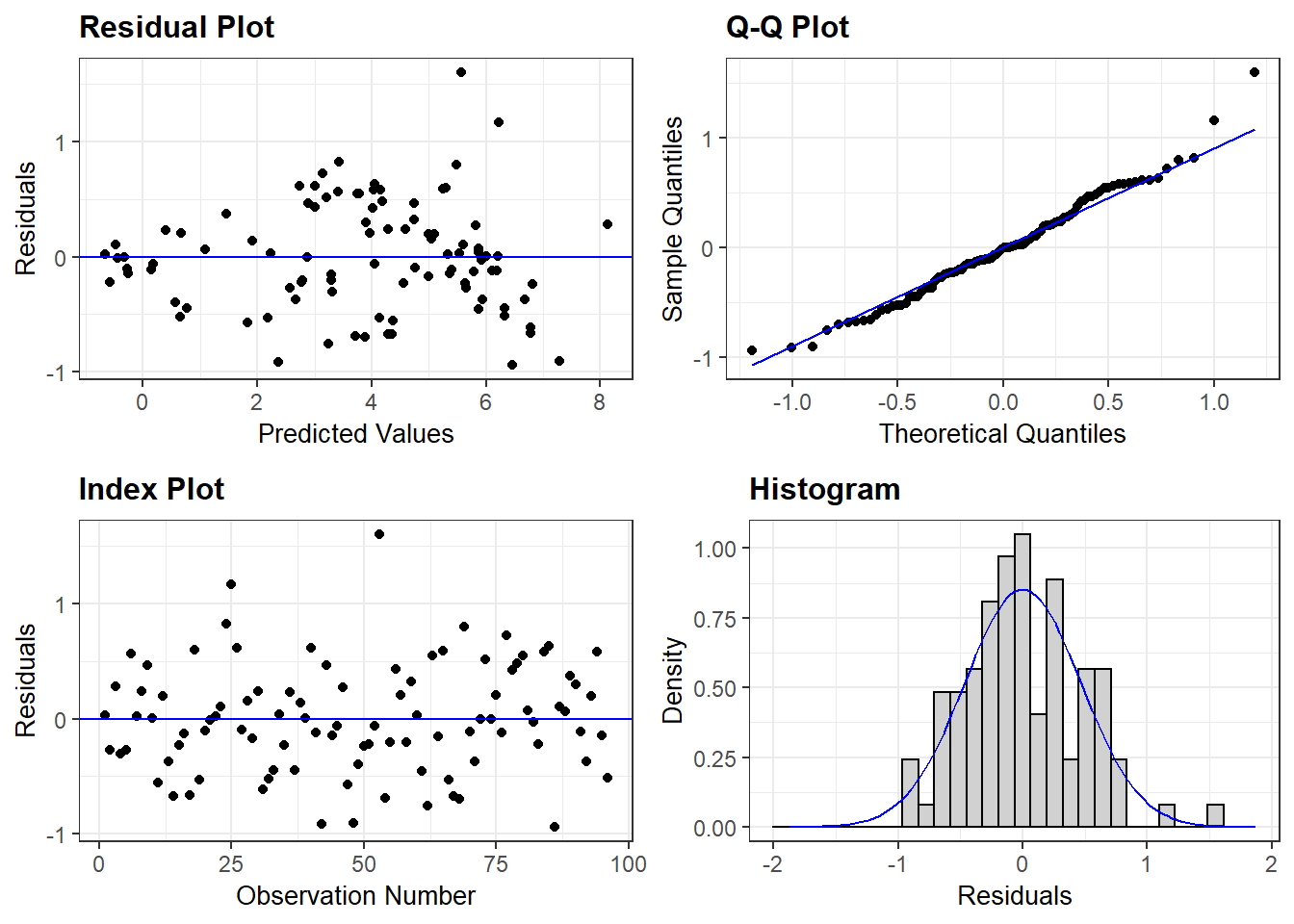
3.3.3.1 ggResidpanel package for residuals
As mentioned in chapter 2, ggResidpanel is a newer package that isn’t yet installed on Carleton computers and Rstudio servers so everyone who wants to use it will need to install it.
resid_panel provides a wide variety of residual-based diagnostic plots (more than just the 4 shown in the default settings below). See the help file for how to specify options:
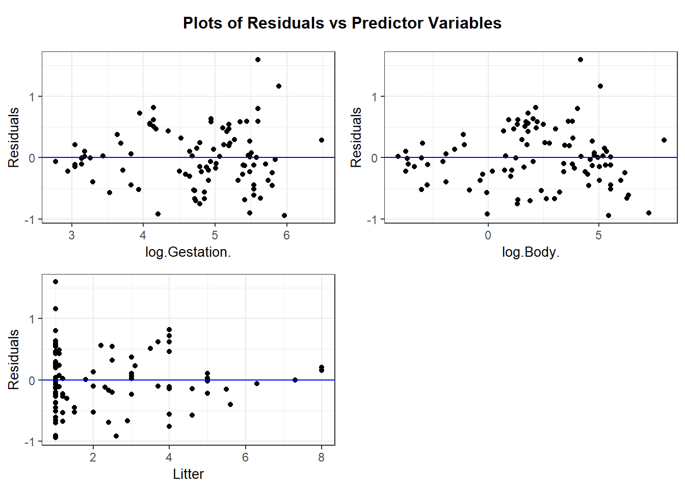
resid_xpanel provides residual plots for predictor variables:
resid_interact creates interactive (i.e. clickable) plots
Points are identified by the row (observation) number based on a complete case data frame that omits any cases that have NA for one or more variables used in your model. If your model summary indicates that you have missing cases then take care when using the observation number indicated by the interactive plot!
3.3.3.2 Summary of this model
The residual plots for the logged model reveal some outliers that should be explored but the overall fit, while not perfect, is much better than the untransformed version.
| term | estimate | std.error | statistic | p.value |
|---|---|---|---|---|
| (Intercept) | 0.8234 | 0.6621 | 1.2437 | 0.2168 |
| log(Gestation) | 0.4396 | 0.1370 | 3.2095 | 0.0018 |
| log(Body) | 0.5745 | 0.0326 | 17.6009 | 0.0000 |
| Litter | -0.1104 | 0.0423 | -2.6115 | 0.0105 |
The estimated median function for this model is \[ \widehat{median}(y \mid x) = e^{0.8234}(Gest)^{0.4396}(Body)^{0.5745}e^{-0.1104(Litter)} \]
The effect of Gestation is interpreted as you would in a power model (both variables logged). For example, doubling gestational days is associated with an estimated $(2^{0.4396}-1)100%=$35.6% increase in median brain weight, holding body weight and litter size constant.
The effect of Litter is interpreted as you would in an exponential model (with just the response logged). For example, after controlling for body size and gestation time, each additional offspring decreases estimated median brain weight by 10.5% (work is \((e^{-0.1104}-1)100%=\)).
3.3.4 EDA for interactions
We visualize interactions by using a graphic that looks at the relationship between \(y\) and \(x_1\) while holding the value of \(x_2\) fixed (or almost fixed), and vice versa for flipping the role of \(x\) variables. An interaction may be needed if the relationship between \(y\) and \(x_1\) depends on the value of \(x_2\).
3.3.4.1 Predictors: one quantitative and one categorical
For example, if \(x_1\) is quantitative and \(x_2\) is categorical, then we use facet_wrap (or facet_grid) to split the scatterplot of \(y\) vs. \(x_1\) by group of \(x_2\):
3.3.4.2 Predictors: both quantitative
We use the same facet_wrap function, but we need to group the data into similar cases with respect to their \(x_2\) value, which is now assumed to be quantitative. One way to do this is to use the ntile(n=) function from dplyr package where n determines how many groups the data will be divided into.
Is there an interaction between body weight and gestation?? Does the relationship between brain weight and gestation length change as we vary body weight? If yes, then we should include an interaction term between gestation and body weight.
Here we hold body weight “fixed” by using the ntile command from the dplyr package to divide the data into chunks of animals with similar body weights. Here we pick n=4 for this function which divides the cases into 4 equal sized chunks based on the quartiles (4) of Body. In the plot below the cases in “1” are the lower 25% of body weights, “2” are the 25-50th percentile values of Body weights, etc.
ggplot(brain, aes(x=Gestation, y=Brain)) +
  geom_point() + geom_smooth(method="lm", se=FALSE) +
  scale_x_log10() + scale_y_log10() +
  facet_wrap(~ ntile(Body, n=4))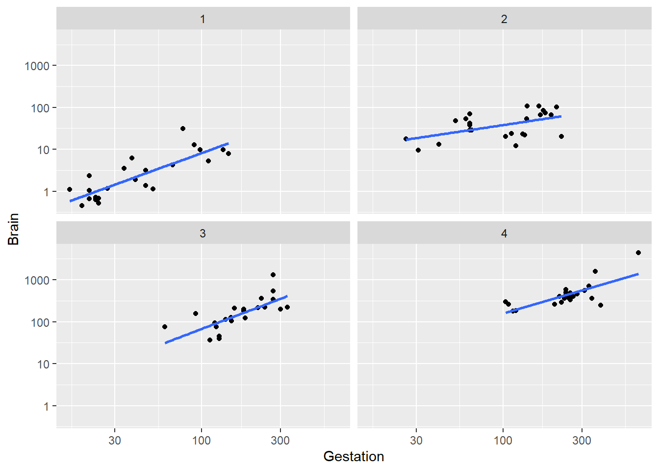
Conclusion: the trend within each level of body weight is about the same. No obvious interactive effect of body weight and gestation length on brain weight. Of course we can always check significance by adding interaction term to model:
brain_lm3 <- lm(log(Brain) ~ log(Gestation) + log(Body) + Litter + log(Gestation):log(Body), data=brain)
summary(brain_lm3)
##
## Call:
## lm(formula = log(Brain) ~ log(Gestation) + log(Body) + Litter +
## log(Gestation):log(Body), data = brain)
##
## Residuals:
## Min 1Q Median 3Q Max
## -0.95837 -0.29354 0.01594 0.27960 1.62013
##
## Coefficients:
## Estimate Std. Error t value Pr(>|t|)
## (Intercept) 0.64124 0.67137 0.955 0.342050
## log(Gestation) 0.48758 0.14051 3.470 0.000797 ***
## log(Body) 0.69602 0.09268 7.510 3.91e-11 ***
## Litter -0.10050 0.04264 -2.357 0.020566 *
## log(Gestation):log(Body) -0.02678 0.01914 -1.399 0.165080
## ---
## Signif. codes: 0 '***' 0.001 '**' 0.01 '*' 0.05 '.' 0.1 ' ' 1
##
## Residual standard error: 0.4731 on 91 degrees of freedom
## Multiple R-squared: 0.9545, Adjusted R-squared: 0.9525
## F-statistic: 477.4 on 4 and 91 DF, p-value: < 2.2e-163.3.5 Quadratic models: Corn yields (exercise 9.15)
This final example illustrates a quadratic model fit and scatterplot. Consider the corn yield data in textbook exercise 9.15. How is corn yield (measured bushels/acre) in a year related to the amount of rainfall (inches) in that summer?
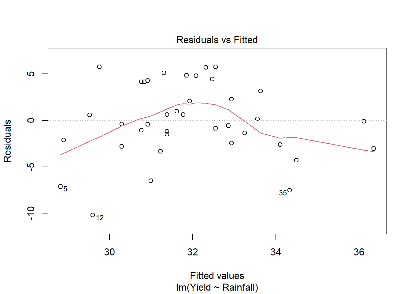
A linear model for yield against rainfall is not appropriate:
##       Year          Yield          Rainfall
##  Min.   :1890   Min.   :19.40   Min.   : 6.800
##  1st Qu.:1899   1st Qu.:29.95   1st Qu.: 9.425
##  Median :1908   Median :32.15   Median :10.500
##  Mean   :1908   Mean   :31.92   Mean   :10.784
##  3rd Qu.:1918   3rd Qu.:35.20   3rd Qu.:12.075
## Max. :1927 Max. :38.30 Max. :16.500ggplot(corn, aes(x=Rainfall, y=Yield)) +
geom_point() +
geom_smooth(method="lm", se=FALSE) +
labs(title="SLR model")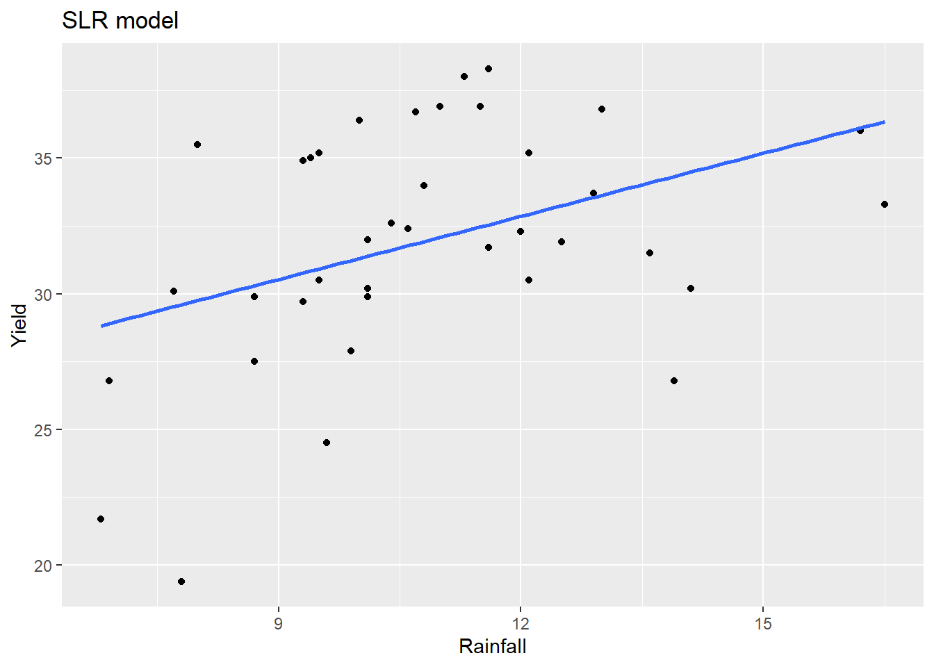
We can add a quadratic term (using the I() operator):
Alternatively, we can update model 1 (SLR) using the update command: on right side of formula the ~ . + newstuff says to add the newstuff to the old model formula which is denoted with the period . .
##
## Call:
## lm(formula = Yield ~ Rainfall + I(Rainfall^2), data = corn)
##
## Residuals:
##     Min      1Q  Median      3Q     Max
## -8.4642 -2.3236 -0.1265  3.5151  7.1597
##
## Coefficients:
##               Estimate Std. Error t value Pr(>|t|)
## (Intercept)   -5.01467   11.44158  -0.438  0.66387
## Rainfall       6.00428    2.03895   2.945  0.00571 **
## I(Rainfall^2) -0.22936    0.08864  -2.588  0.01397 *
## ---
## Signif. codes:  0 '***' 0.001 '**' 0.01 '*' 0.05 '.' 0.1 ' ' 1
##
## Residual standard error: 3.763 on 35 degrees of freedom
## Multiple R-squared:  0.2967, Adjusted R-squared:  0.2565
## F-statistic: 7.382 on 2 and 35 DF,  p-value: 0.002115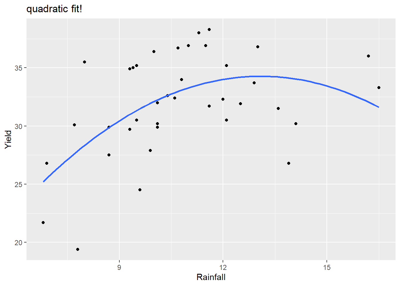
This residual plot looks much better for this quadratic model compared to the linear model.
We can visualize this quadratic model using the geom_smooth(method="lm") function but we have to specify this model form since the default is a SLR. This is done in the formula argument, using y and x to denote the x and y that you specify in the aes argument.
ggplot(corn, aes(x=Rainfall, y=Yield)) +
  geom_point() +
  geom_smooth(method="lm", formula= y ~ x + I(x^2),  se=FALSE) +
  labs(title="quadratic fit!")
The model fit is
| term | estimate | std.error | statistic | p.value |
|---|---|---|---|---|
| (Intercept) | -5.0147 | 11.4416 | -0.4383 | 0.6639 |
| Rainfall | 6.0043 | 2.0389 | 2.9448 | 0.0057 |
| I(Rainfall^2) | -0.2294 | 0.0886 | -2.5877 | 0.0140 |
so \[ \hat{\mu}(yield \mid rain) = -5.0147 + 6.0043(rain)- 0.2294(rain)^2 \] An increase from 9 to 10 inches of rainfall is associated with a mean yield increase of 1.646 bushels per acre. \[ 6.0043- 0.2294(2\times 9 + 1) = 1.646 \] An increase from 14 to 15 inches of rainfall is associated with a mean yield decrease of 0.648 bushels per acre. \[ 6.0043- 0.2294(2\times 14 + 1) = -0.648 \]
3.4 Categorical Predictors
Categorical predictors can be included in a regression model the same way that a quantitative predictor can. But since a categorical variable doesn’t have a numerical scaling, we don’t have a “linearity” assumption that needs to be met (though the three other assumptions still hold). A categorical variable is included by using one or more indicator variables (aka dummy variables) which indicate different levels of the variable.
- An indicator variable equals 1 to indicate the level of interest, and is 0 otherwise.
- The baseline level of an indicator variable is the level of the factor variable that doesn’t have an indicator variable made for it.
- R will create indicator variables for us in an
lm, so there is no need to do this “by hand”.
If a variable, which is stored as a factor in R, has \(k\) levels then we need \(k-1\) indicator variables. Consider the following examples to illustrate this idea.
Suppose we are looking at how gender and education level are associated with income. If there are two genders in our data, here recorded as Female and Male, then we need one indicator to indicate one of the two levels. R will create an indicator for the second level, ordered alphabetically. If a case has Indicator_Male=1 then the case is Male but if the case has Indicator_Male=0 then the case is Female. So this one indicator variable can classify two levels and the baseline level is Female.
| Gender | Indicator_Male |
|---|---|
| Female | 0 |
| Male | 1 |
Suppose we are looking at how number of farms per county in 1992 is related to number of farms in 1987 and region of the country. If there are four regions in our data, here recorded as NC, NE, S and W, then we need three indicators. R will create an indicator for all but the first level of NC. If a case has Indicator_NE=1 then the case is NE, if the case has Indicator_S=1 then the case is S, if the case has Indicator_W=1 then the case is W. If a case has all indicator values equal to 0, then the case is the baseline level of NC. So we need three indicators to classify the four region levels.
| Region | Indicator_NE | Indicator_S | Indicator_W |
|---|---|---|---|
| NC | 0 | 0 | 0 |
| NE | 1 | 0 | 0 |
| S | 0 | 1 | 0 |
| W | 0 | 0 | 1 |
3.4.1 Interpretation: adding a categorical variable
You add a categorical predictor x2 to the lm function just as you would any quantitative predictor: lm(y ~ x1 + x2, data). R automatically creates indicator variables for x2. When adding a categorical x2 which has, say levels A, B and C, the basic mean function form looks like:
\[
\mu(Y \mid x_1, x_2) = \beta_0 + \beta_1 x_1 + \beta_2 LevelB + \beta_3 LevelC
\]
The mean function for cases where \(x_2=A\) sets the indicators for levels B and C equal to 0:
\[
\mu(Y \mid x_1, x_2=A) = \beta_0 + \beta_1 x_1 + \beta_2 (0) + \beta_3 (0) = \beta_0 + \beta_1 x_1
\]
The mean function for cases where \(x_2=B\) sets the indicator for level B equalt to 1 and the indicator for level C equal to 0:
\[
\mu(Y \mid x_1, x_2=B) = \beta_0 + \beta_1 x_1 + \beta_2 (1) + \beta_3 (0) = \beta_0 + \beta_1 x_1 + \beta_2
\]
The mean function for cases where \(x_2=C\) sets the indicator for level C equalt to 1 and the indicator for level B equal to 0:
\[
\mu(Y \mid x_1, x_2=C) = \beta_0 + \beta_1 x_1 + \beta_2 (0) + \beta_3 (1) = \beta_0 + \beta_1 x_1 + \beta_3
\]
Interpretation of indicator effects:
- \(\beta_2\) is the difference between \(\mu(Y \mid x_1, x_2=B)\) and \(\mu(Y \mid x_1, x_2=A)\), so it measures the mean change between levels
BandA, holding \(x_1\) fixed. - \(\beta_3\) is the difference between \(\mu(Y \mid x_1, x_2=C)\) and \(\mu(Y \mid x_1, x_2=A)\), so it measures the mean change between levels
CandA, holding \(x_1\) fixed. - \(\beta_2-\beta_3\) is the difference between \(\mu(Y \mid x_1, x_2=B)\) and \(\mu(Y \mid x_1, x_2=C)\), so it measures the mean change between levels
BandC, holding \(x_1\) fixed.
3.4.1.1 Example: Palmer penguins
The palmerpenguins package contains the data set penguins which contains physical measurements for a sample of 344 penguins.
| Name | penguins |
| Number of rows | 344 |
| Number of columns | 8 |
| _______________________ | |
| Column type frequency: | |
| factor | 3 |
| numeric | 5 |
| ________________________ | |
| Group variables | None |
Variable type: factor
| skim_variable | n_missing | complete_rate | ordered | n_unique | top_counts |
|---|---|---|---|---|---|
| species | 0 | 1.00 | FALSE | 3 | Ade: 152, Gen: 124, Chi: 68 |
| island | 0 | 1.00 | FALSE | 3 | Bis: 168, Dre: 124, Tor: 52 |
| sex | 11 | 0.97 | FALSE | 2 | mal: 168, fem: 165 |
Variable type: numeric
| skim_variable | n_missing | complete_rate | mean | sd | p0 | p25 | p50 | p75 | p100 | hist |
|---|---|---|---|---|---|---|---|---|---|---|
| bill_length_mm | 2 | 0.99 | 43.92 | 5.46 | 32.1 | 39.23 | 44.45 | 48.5 | 59.6 | ▃▇▇▆▁ |
| bill_depth_mm | 2 | 0.99 | 17.15 | 1.97 | 13.1 | 15.60 | 17.30 | 18.7 | 21.5 | ▅▅▇▇▂ |
| flipper_length_mm | 2 | 0.99 | 200.92 | 14.06 | 172.0 | 190.00 | 197.00 | 213.0 | 231.0 | ▂▇▃▅▂ |
| body_mass_g | 2 | 0.99 | 4201.75 | 801.95 | 2700.0 | 3550.00 | 4050.00 | 4750.0 | 6300.0 | ▃▇▆▃▂ |
| year | 0 | 1.00 | 2008.03 | 0.82 | 2007.0 | 2007.00 | 2008.00 | 2009.0 | 2009.0 | ▇▁▇▁▇ |
There are three species in the data and a couple missing values for each measurement variable. We will look at a model for body mass (body_mass_g) as a function of bill length (bill_length_mm) and species (species). To simplify this example, we will focus on the Gentoo and Adelie species. The data set penguins_small is the data we will use for the rest of this section.
penguins_small <- penguins %>%
  filter(species %in% c("Gentoo", "Adelie")) %>%   # only 2 species
  select(species, bill_length_mm, body_mass_g) %>%  # pick variables
  drop_na()   # remove rows with missing values
The relationship in our sample looks like the each species has a similar linear trend within each species group. Gentoo look to be bigger birds, overall, but is this still the case if we “control for” bill length? Put another way, for penguins with the same bill length, will the Gentoos be bigger than Adelies, on average?
ggplot(penguins_small, aes(bill_length_mm, body_mass_g, color = species)) +
  geom_point() +
  geom_smooth(se = FALSE)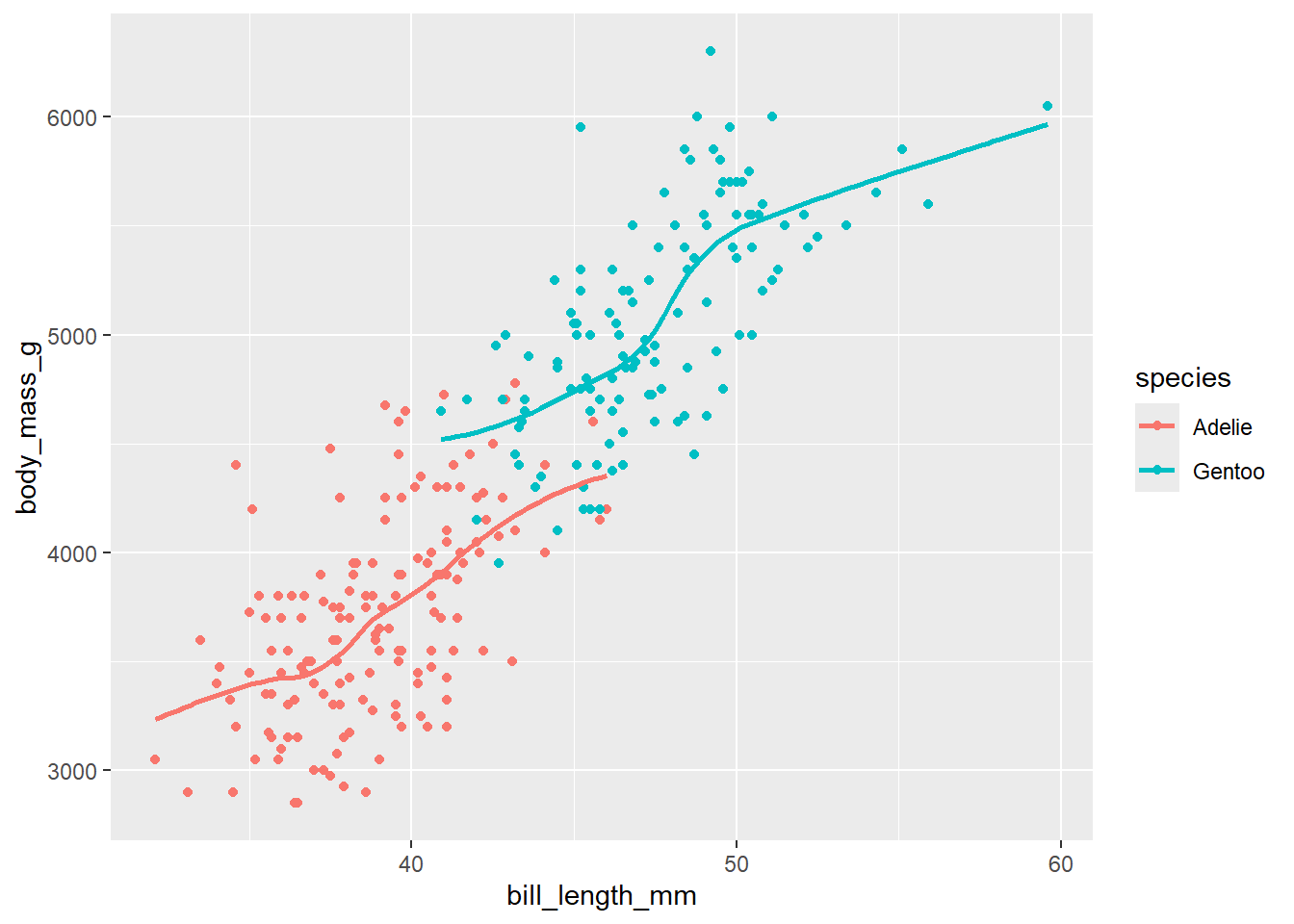
The model that we will consider first is the regression of body mass on bill length and species. The model mean form is
\[\mu(mass \mid bill, species) = \beta_0 + \beta_1 (\textrm{bill length}) + \beta_2 (\textrm{Gentoo})\]
where Gentoo is the indicator for the (second level) of species which is the Gento group.
This model is spcifying the following models for each of the two subpopulations (groups) of species:
Model for Adelie Our indicator Gentoo is 0 for all Adelie penguins, so their mean mass function is
\[\begin{split}
\mu(mass \mid bill, species = Adelie) &= \beta_0 + \beta_1 (\textrm{bill length}) + \beta_2 (0) \\
& =\beta_0 + \beta_1 (\textrm{bill length})
\end{split}\]
Model for Gentoo Our indicator Gentoo is 1 for all Gentoo penguins, so their mean mass function is
\[\begin{split}
\mu(mass \mid bill, species = Gentoo) &= \beta_0 + \beta_1 (\textrm{bill length}) + \beta_2 (1) \\
& = (\beta_0 + \beta_2) + \beta_1 (\textrm{bill length})
\end{split}\]
Parameter interpretation
\(\beta_0\) is the y-intercept for the Adelie mean line
\(\beta_1\) is the effect of bill length of body mass for both Adelie and Gentoo species. Because both species have this same effect, or mean line slope, this is a parallel lines model. Each species has a different mean line, but the slopes of these lines are the same.
\(\beta_2\) is the difference of the y-intercept for the Adelie mean line and the Gentoo mean lines. Because the slopes of each lines are the same, \(\beta_2\) also measures the gap, or difference, between mean body mass for Gentoo and Adelie penguins that all have the same bill length. Mathematically, for the same bill length: \[\begin{split} \mu(mass \mid bill, Gentoo) - \mu(mass \mid bill, Adelie) &= [\beta_0 + \beta_2 + \beta_1 (\textrm{bill length})] - \\ & \ \ \ \ \ [\beta_0 + \beta_1 (\textrm{bill length})]\\ &= \beta_2 \end{split}\]
This parallel lines model is fit below.
peng_lm <- lm(body_mass_g ~ bill_length_mm + species,
              data = penguins_small)
library(broom)
library(knitr)
kable(tidy(peng_lm))| term | estimate | std.error | statistic | p.value |
|---|---|---|---|---|
| (Intercept) | -267.6225 | 314.796695 | -0.8501441 | 0.3959954 |
| bill_length_mm | 102.2981 | 8.075713 | 12.6673742 | 0.0000000 |
| speciesGentoo | 483.9810 | 84.203349 | 5.7477641 | 0.0000000 |
## [1] 216.3585The estimated mean body mass is \[\hat{\mu}(mass \mid bill, species) = -267.6225 + 102.2981 (\textrm{bill length}) + 483.9810 (\textrm{Gentoo})\] Model for Adelie \[\begin{split} \hat{\mu}(mass \mid bill, Adelie) &= -267.6225 + 102.2981 (\textrm{bill length}) \end{split}\]
Model for Gentoo \[\begin{split} \hat{\mu}(mass \mid bill, Gentoo) &= -267.6225 + 102.2981 (\textrm{bill length}) + 483.9810 \\ & = 216.3585+ 102.2981 (\textrm{bill length}) \end{split}\]
Parameter interpretation
\(\hat{\beta}_1 = 102.2981\): Holding species constant, a 1 mm increase in bill length is associated with an estimated increase in mean body mass of 102.3 g.
\(\hat{\beta}_2 = 483.9810\): For penguins with the same bill length, the Gentoo mean mass is estimated to be 484.9 g higher than the mean mass of Adelie.
Graphing a parallel line model:
There is no quick way to add parallel lm lines in ggplot (adding a geom_smooth doesn’t force the slopes of different groups to be parallel!). But, we can use geom_line to visualize our parallel lines model once we add the model’s fitted values to the data set with the augment command:
penguins_small_aug <- augment(peng_lm)  # add fitted values
ggplot(penguins_small_aug,
       aes(bill_length_mm, body_mass_g, color = species)) +
  geom_point() +
  geom_line(aes(y = .fitted), size = 1) +
  labs(title = "parallel lines model")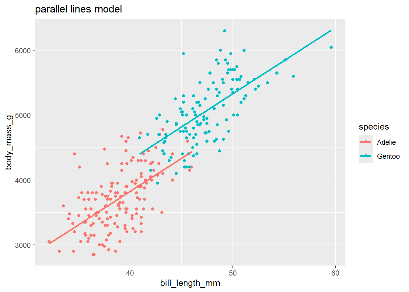
3.4.2 Interpretation: adding a categorical interaction
What if we thought that the effect of \(x_1\) depends on the level of the categorical variable \(x_2\). E.g. What if the slopes for each region in the above scatterplot were allowed different? To create a separate lines model we would add the interaction of \(x_1\) and \(x_2\): lm(y ~ x1 * x2, data). When adding a categorical x2 which has, say levels A, B and C, the basic mean function form looks like:
\[
\mu(Y \mid x_1, x_2) = \beta_0 + \beta_1 x_1 + \beta_3 LevelB + \beta_4 LevelC + \beta_5 x_1LevelB + \beta_6 x_1LevelC
\]
The mean function for cases where \(x_2=A\) sets the indicators for levels B and C equal to 0:
\[
\mu(Y \mid x_1, x_2=A) = \beta_0 + \beta_1 x_1 + \beta_3 (0) + \beta_4 (0) = \beta_0 + \beta_1 x_1 + \beta_5 x_1(0) + \beta_6 x_1(0) = \beta_0 + \beta_1 x_1
\]
The mean function for cases where \(x_2=B\) sets the indicator for level B equalt to 1 and the indicator for level C equal to 0:
\[\begin{split}
\mu(Y \mid x_1, x_2=B)& = \beta_0 + \beta_1 x_1 + \beta_3 (1) + \beta_4 (0) + \beta_5 x_1(1) + \beta_6 x_1(0) \\
& = (\beta_0+ \beta_3) + (\beta_1+\beta_5) x_1
\end{split}\]
The mean function for cases where \(x_2=C\) sets the indicator for level C equalt to 1 and the indicator for level B equal to 0:
\[\begin{split}
\mu(Y \mid x_1, x_2=C) & = \beta_0 + \beta_1 x_1 + \beta_3 (0) + \beta_4 (1) + \beta_5 x_1(0) + \beta_6 x_1(1)\\
& = (\beta_0+ \beta_4) + (\beta_1+\beta_6) x_1
\end{split}\]
Interpretation of indicator effects:
- \(\beta_3\) is the difference between \(\mu(Y \mid x_1=0, x_2=B)\) and \(\mu(Y \mid x_1=0, x_2=A)\) at the intercept where \(x_1=0\).
- \(\beta_4\) is the difference between \(\mu(Y \mid x_1=0, x_2=C)\) and \(\mu(Y \mid x_1=0, x_2=A)\) at the intercept where \(x_1=0\).
- \(\beta_1\) is the effect of \(x_1\) when \(x_2 = A\) (level A)
- \(\beta_1+\beta_5\) is the effect of \(x_1\) when \(x_2 = B\) (level B)
- \(\beta_5\) measures how much more or less the effect of \(x_1\) is in level B compared to level A (difference in slopes of the two lines)
- \(\beta_1+\beta_6\) is the effect of \(x_1\) when \(x_2 = C\) (level C)
- \(\beta_6\) measures how much more or less the effect of \(x_1\) is in level C compared to level A (difference in slopes of the two lines)
3.4.2.1 Example: Sleep
This data sleep contains information on the sleep and physical characteristics of 51 species of mammals. Our goal is to see how TS, the total amount of sleep (hours) that an animal gets in 24 hours is related to BodyWt, its body weight (kg), and danger, the amount of danger (low danger to high danger) to which it is exposed.
##    Species                TS            BodyWt            BrainWt
##  Length:51          Min.   : 2.60   Min.   :   0.005   Min.   :   0.14
##  Class :character   1st Qu.: 7.30   1st Qu.:   0.615   1st Qu.:   4.50
##  Mode  :character   Median :10.30   Median :   3.385   Median :  21.00
##                     Mean   :10.35   Mean   : 224.363   Mean   : 317.50
##                     3rd Qu.:13.20   3rd Qu.:  44.245   3rd Qu.: 172.00
##                     Max.   :19.90   Max.   :6654.000   Max.   :5712.00
##       Life              GP              D            danger
##  Min.   :  2.00   Min.   : 12.0   Min.   :1.000   Length:51
##  1st Qu.:  6.25   1st Qu.: 42.0   1st Qu.:1.000   Class :character
##  Median : 14.00   Median :100.0   Median :2.000   Mode  :character
##  Mean   : 20.15   Mean   :142.1   Mean   :2.627
##  3rd Qu.: 27.50   3rd Qu.:205.0   3rd Qu.:4.000
## Max. :100.00 Max. :645.0 Max. :5.000##
## high low moderate very high very low
## 9 12 8 7 15Notice that the 5 levels of danger are not naturally ordered in our table summary. This means they won’t be naturally ordered (low to high) in any graphical or numerical summaries or models. We can use the forcats package to reorder the existing levels of our danger variable using the fct_relevel command:
library(forcats)
sleep$danger <- fct_relevel(sleep$danger,
                            "very low",
                            "low",
                            "moderate",
                            "high",
                            "very high")
table(sleep$danger)   # verify that relevel worked!
##
## very low low moderate high very high
## 15 12 8 9 7When we add lm lines to a scatterplot with color coded points, then ggplot will fit separate lines for each color. Here we plot TS (total sleep) against the logged version of BodyWt since we don’t have a linear relationship on the untransformed scale.
library(ggplot2)
ggplot(sleep, aes(x = BodyWt, y = TS, color = danger)) +
  geom_point() +
  geom_smooth(method = "lm", se = FALSE) +
  scale_x_log10() +
  labs(title = "daily sleep vs. body weight by danger level")
This plot suggests that there may be an interaction between danger and BodyWt since the lm lines have some variation in slope across danger levels. The model we will fit has ten parameters ($_0-_9) due to the four indicator variables that are also interacted with body weight:
\[\begin{split} \mu(TS \mid body, danger) &= \beta_0 + \beta_1 \log(body) + \beta_2 low + \beta_3 moderate + \beta_4 high + \\ & \beta_5 veryhigh + \beta_6 \log(body)low + \beta_7 \log(body)moderate + \\ & \beta_8 \log(body)high + \beta_9 \log(body)veryhigh \end{split} \]
##
## Call:
## lm(formula = TS ~ log(BodyWt) * danger, data = sleep)
##
## Coefficients:
##                 (Intercept)                  log(BodyWt)
##                    14.69190                     -0.89530
##                   dangerlow               dangermoderate
##                    -2.87974                     -5.22057
##                  dangerhigh              dangervery high
##                    -5.05110                     -7.85480
##       log(BodyWt):dangerlow   log(BodyWt):dangermoderate
##                    -0.14434                     -0.02525
##      log(BodyWt):dangerhigh  log(BodyWt):dangervery high
##                     0.48393                      0.21789
The estimated mean function is \[\begin{split} \mu(TS \mid body, danger) &= 14.692 -0.895 \log(body)-2.800 low -5.221 moderate -5.051 high - \\ & 7.855 veryhigh -0.144 \log(body)low -0.025\log(body)moderate + \\ & 0.484 \log(body)high + 0.218 \log(body)veryhigh \end{split} \]
There are many parameters to interpret, so here are a few examples:
\(\beta_1\) is the effect of body weight for species in the “very low” danger level. To see this, write out the mean functions for the two levels. For very low level: \[\begin{split} \mu(TS \mid body, danger=verylow) &= \beta_0 + \beta_1 \log(body) + \beta_2 (0) + \beta_3 (0) + \beta_4 (0) + \beta_5 (0) \\ & + \beta_6 \log(body)(0) + \beta_7 \log(body)(0) + \beta_8 \log(body)(0) + \beta_9 \log(body)(0) \\ & = \beta_0 + \beta_1 \log(body) \end{split}\]
\(\beta_9\) tells us how the effect of body weight differs for the very low and very high danger levels. Compare the mean response for very low to the mean response for the very high level: \[\begin{split} \mu(TS \mid body, danger=veryhigh) &= \beta_0 + \beta_1 \log(body) + \beta_2 (0) + \beta_3 (0) + \beta_4 (0) + \beta_5 (1) \\ & + \beta_6 \log(body)(0) + \beta_7 \log(body)(0) + \beta_8 \log(body)(0) + \beta_9 \log(body)(1) \\ & = (\beta_0 + \beta_5) + (\beta_1 + \beta_9) \log(body) \end{split}\] In the “very low” model, \(\beta_1\) measures the effect of body weight on mean sleep while in the “very high” model, \(\beta_1 + \beta_9\) measures this effect. So the parameter \(\beta_9\) tells us how this effect differs for the two danger levels. The small estimated value \(\hat{\beta}_9 = 0.218\), along with the separate lines scatterplot, suggest that the effect of body weight for the very high danger species is a bit larger (steeper slope) than for very low danger species.
The parameter function \(\beta_5 + \beta_9 \log(body)\) tells us the difference in total sleep between the very high and very low danger levels at a given value of body weight. Recall that in this interaction model, the effect of danger should depend on the value of body weight. For example, for animals that are 1kg in weight, the parameter \(\beta_5 + \beta_9\log(1) = \beta_5\) measures the difference in mean total sleep for the very high and very low levels. The estimated parameter value of \(\hat{\beta}_5 = -7.855\) and the large difference shown in the scatterplot suggest that for 1 kg animals, that the average total sleep for animals with very high danger is about 7 hours less than for animals in very low danger.
To determine if the effect of body weight on mean total sleep differs for “high” and “moderate” levels of danger, we would test the hypotheses \[ H_0: \beta_8 = \beta_7 \ \ \ \ vs. \ \ \ \ H_A: \beta_8 \neq \beta_7 \] Again, write down the mean equations for these two levels. For “high” all dummy variables equal 0 expect
highequals 1: \[\begin{split} \mu(TS \mid body, danger=high) &= \beta_0 + \beta_1 \log(body) + \beta_2 (0) + \beta_3 (0) + \beta_4 (1) + \beta_5 (0) \\ & + \beta_6 \log(body)(0) + \beta_7 \log(body)(0) + \beta_8 \log(body)(1) + \beta_9 \log(body)(0) \\ & = (\beta_0 + \beta_4) + (\beta_1 + \beta_8) \log(body) \end{split} \] for “moderate” all dummy variables equal 0 expectmoderateequals 1. \[\begin{split} \mu(TS \mid body, danger=moderate) &= \beta_0 + \beta_1 \log(body) + \beta_2 (0) + \beta_3 (1) + \beta_4 (0) + \beta_5 (0) \\ & + \beta_6 \log(body)(0) + \beta_7 \log(body)(1) + \beta_8 \log(body)(0) + \beta_9 \log(body)(0) \\ & = (\beta_0 + \beta_3) + (\beta_1 + \beta_7) \log(body) \end{split}\] In the “high” model, \(\beta_1 + \beta_8\) measures the effect of body weight on mean sleep while in the “moderate” model, \(\beta_1 + \beta_7\) measures this effect. Our null hypothesis would state that these two effects are equal: \[ H_0: \beta_1 + \beta_8 = \beta_1 + \beta_7 \] which simplifies to the hypothesis given above.
3.5 Inference for MLR
Inference methods for individual \(\beta\)-parameters, the mean function \(\mu\) and predictions are all very similar to the inference methods outlined for SLR models in Sections 2.7 and 2.8. The biggest difference is that we now use a t-distribution with degrees of freedom equal to \(\pmb{n-(p+1)}\) where \(p+1\) is equal to the number of \(\beta\)’s in the mean function.
To review:
Confidence Intervals for \(\pmb{\beta}_i\): A \(C\)% confidence for \(\beta_i\) has the form: \[ \hat{\beta}_i \pm t^* SE(\hat{\beta}_i) \] where \(t^*\) is the \((100-C)/2\) percentile from the t-distribution with \(df=n-(p+1)\) degrees of freedom.
Hypothesis tests We can test the hypothesis \[ H_0: \beta_i = 0 \ \ \ \ vs. \ \ \ \ H_A: \beta_i \neq 0 \] with the following t-test statistic: \[ t =\dfrac{\hat{\beta}_i - 0}{SE(\hat{\beta}_i)} \] The t-distribution with \(n-(p+1)\) degrees of freedom is used to compute the p-value that is appropriate for whatever \(H_A\) is specified. Interpretation of results: Recall the general interpretation for the planar model: \(\beta_i\) is the effect of a one unit increase in \(x_i\), holding all other predictors constant. Testing \(\pmb{\beta}_i =0\) is the same as asking: Is the observed effect of \(x_i\) on \(\mu\) statistically significant after accounting for all other terms in the model? For this reason, an individual t-test is only good for determing if \(x_i\) is needed in a model that contains all other terms. If you want to test the significance of multiple predictors at once, you need to conduct an F-test using ANOVA (Section 3.6.
Inference for \(\pmb{\mu(Y \mid X_0)}\) and \(\pmb{pred(Y \mid X_0)}\): Confidence and prediction intervals calculations are very similar to SLR in Section 3.5.1, except for the change in the degrees of freedom and a slightly more complex form for the SE of the estimated mean response \(SE(\hat{\mu}(Y \mid X_0))\) which now involves more than one predictor.
3.5.1 Inference for a linear combination of \(\beta\)’s
One new inference method which is sometimes needed in MLR models, is to make inferences about a linear combination of \(\beta_i\)’s. A linear combination is of the form: \[ \gamma = c_i \beta_i + c_j \beta_j \] where \(c_i\) and \(c_j\) are known numbers.
Some examples of a linear combination include:
Suppose we fit the quadratic model in Section 3.2.1.2 and want to estimate the change in the mean response for a change in \(x_1\) from 9 to 10. This change is measured by the parameter \[ \gamma = \beta_1 + \beta_2(2\times 9+1) = \beta_1 + 19\beta_2 \] so \(c_1 = 1\) and \(c_2 = 19\).
Suppose we fit the interaction model in Section 3.2.1.3 and want to estimate the change in the mean response for a 1 unit increase in \(x_1\), holding \(x_2\) constant at the value of -5. This change is measured by the parameter \[ \gamma = \beta_1 + \beta_3 (-5) = \beta_1 -5 \beta_3 \] so \(c_1 = 1\) and \(c_3 = -5\).
Any inference for this new \(\gamma\) parameter will rely on an estimate, \(\hat{\gamma}\) and standard error \(SE(\hat{\gamma})\).
- Estimation: Just plug in our \(\beta\) estimates! \[ \hat{\gamma} = c_i \hat{\beta}_i + c_j \hat{\beta}_j \]
- SE: This is more complex of a calculation because the estimates \(\hat{\beta}_i\) and \(\hat{\beta}_i\) are correlated. We can see this for \(\hat{\beta}_0\) and \(\hat{\beta}_1\) in the SLR simulation in Section 2.6.4. We use probabilities rules for the linear combination of two correlated random variables to derive our SE as \[ SE(\hat{\gamma}) = \sqrt{c^2_i Var(\hat{\beta}_i) + c^2_j Var(\hat{\beta}_j) + 2c_i c_j Cov(\hat{\beta}_i, \hat{\beta}_j) } \] The variances (\(Var\)) values are the squared SE’s for each estimate, e.g. \(Var(\hat{\beta}_i) = SE(\hat{\beta}_i)^2\). The covariance (\(Cov\)) value measures how the two estiamtes co-vary together over many, many samples from the populations (just like SE tells us how each estimate varies by itself). Positive values of covariance means the two estimates are positively correlated, negative means negatively correlated. The magnitude of the covariance is a function of each estimate’s SE. In R, we will get these variance and covariance values from a MLR model’s estimated covariance matrix, which for a MLR planar model with two predictors will look like a 3x3 matrix with variance values on the diagonal and covariance values on the off-diagonals: \[ \begin{pmatrix} Var(\hat{\beta}_0) & Cov(\hat{\beta}_0, \hat{\beta}_1) & Cov(\hat{\beta}_0, \hat{\beta}_2) \\ Cov(\hat{\beta}_1, \hat{\beta}_0) & Var(\hat{\beta}_1)& Cov(\hat{\beta}_1, \hat{\beta}_2) \\ Cov(\hat{\beta}_2, \hat{\beta}_0)& Cov(\hat{\beta}_2, \hat{\beta}_1)& Var(\hat{\beta}_2) \end{pmatrix} \] Note that covariance is symmetric so that \(Cov(\hat{\beta}_i, \hat{\beta}_j) = Cov(\hat{\beta}_j, \hat{\beta}_i)\).
Inference for \(\gamma\) then looks like:
- Confidence interval for \(\pmb{\gamma}\): \(\hat{\gamma} \pm t^*_{df} SE(\hat{\gamma})\)
- Hypothesis test for \(\pmb{H_0: \gamma = \gamma^*}\): uses the test statistic \[ t = \dfrac{\hat{\gamma} - \gamma^*}{SE(\hat{\gamma})} \] and a p-value from a t-distribution with model degrees of freedom.
3.5.2 Example: Palmer penguins
Let’s revisit the regression of penguin body mass on bill length and species for the smaller version of the data that only contains Adelie and Gentoo (Section 3.4.1.1). The mean function and fitted models are below.
\[\mu(mass \mid bill, species) = \beta_0 + \beta_1 (\textrm{bill length}) + \beta_2 (\textrm{Gentoo})\]
peng_lm <- lm(body_mass_g ~ bill_length_mm + species,
              data = penguins_small)
kable(tidy(peng_lm, conf.int = TRUE))| term | estimate | std.error | statistic | p.value | conf.low | conf.high |
|---|---|---|---|---|---|---|
| (Intercept) | -267.6225 | 314.796695 | -0.8501441 | 0.3959954 | -887.38053 | 352.1354 |
| bill_length_mm | 102.2981 | 8.075713 | 12.6673742 | 0.0000000 | 86.39897 | 118.1972 |
| speciesGentoo | 483.9810 | 84.203349 | 5.7477641 | 0.0000000 | 318.20511 | 649.7569 |
\(\hat{\beta}_1 = 102.30\) is the estimated effect of bill length of body mass for both Adelie and Gentoo species. This estimated effect is statistically significant (t = 12.67, p-value < 0.0001). Holding species constant, a 1 mm increase in bill length is associated with an estimated 102.30 g increase in mean mass (95% CI 86.40 g to 118.20 g).
\(\hat{\beta}_2 = 483.98\) is the gap between the parallel lines for Gentoo and Adelie. This estimated gap is statistically significant (t = 5.75, p-value < 0.0001). Holding bill length constant, the mean body mass for Gentoo is estimated to be 483.98 g higher than the mean body mass for Adelie penguins (95% 318.21 g to 649.76 g).
Prediction: Suppose we want to get a 95% prediction interval for predicting the mass of a Gentoo who has a bill length of 45 mm. We can do this by using the
predictcommand with a data frame containing these new predictor values. We are 95% confident that a new Gentoo penguin with a bill length of 45 mm will be between 4066.1 g to 5573.5 g in mass.
pred_data <- data.frame(bill_length_mm = 45, species = "Gentoo")
predict(peng_lm, newdata = pred_data, interval = "prediction")
## fit lwr upr
## 1 4819.772 4066.09 5573.4543.5.3 Example: more penguinns
Let’s go back to the original Palmer penguins data with all 3 species. We will still remove the two cases with missing values for both mass and bill length.
penguins_complete <- penguins %>%
  select(species, bill_length_mm, body_mass_g) %>%  # pick variables
  drop_na()   # remove rows with missing values
dim(penguins_complete)
## [1] 342 3We will consider the regression of mass on bill length and species again, this time for all three species. Because of the alphabetical ordering of species, the baseline level is Adelie, the first indicator in the model is for Chinstrap and the second is for Gentoo.
\[\mu(mass \mid bill, species) = \beta_0 + \beta_1 (\textrm{bill length}) + \beta_2 (\textrm{Chinstrap})+ \beta_3 (\textrm{Gentoo})\]
peng_complete_lm <- lm(body_mass_g ~ bill_length_mm + species,
              data = penguins_complete)
kable(tidy(peng_complete_lm, conf.int = TRUE))| term | estimate | std.error | statistic | p.value | conf.low | conf.high |
|---|---|---|---|---|---|---|
| (Intercept) | 153.73969 | 268.901233 | 0.5717329 | 0.5678829 | -375.1910 | 682.6704 |
| bill_length_mm | 91.43582 | 6.887119 | 13.2763517 | 0.0000000 | 77.8888 | 104.9828 |
| speciesChinstrap | -885.81208 | 88.250154 | -10.0375131 | 0.0000000 | -1059.4008 | -712.2234 |
| speciesGentoo | 578.62916 | 75.362341 | 7.6779617 | 0.0000000 | 430.3909 | 726.8674 |
peng_complete_lm_aug <- augment(peng_complete_lm)  # add fitted values
ggplot(peng_complete_lm_aug,
       aes(bill_length_mm, body_mass_g, color = species)) +
  geom_point() +
  geom_line(aes(y = .fitted), size = 1) +
  labs(title = "parallel lines model")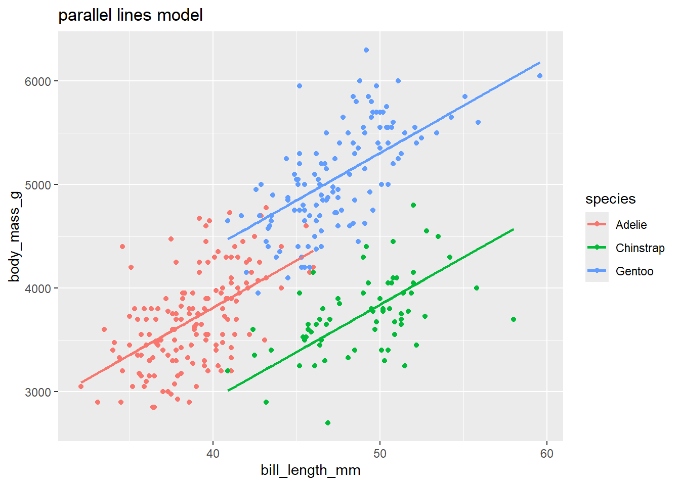
Effect of bill length Adding the additional species to our data (and population we are inferring to), keeps the effect of bill length on mass about the same though there is a small decrease in the estimate (91.44 vs. 102.30).
Compare Gentoo to Adelie: After controlling for the effect of bill length, this model estimates a larger gap between the mean mass of Gentoo and Adelie (578.62 vs. 483.98). Note that because we added another species to the model, we will get a change in the common effect of bill length shared by all species. This change is the reason we see this comarison of Gentoo and Adelie changing too.
Compare Gentoo to Chinstrap: After controlling for the effect of bill length, what is the difference in the mean mass of Gentoo and Chinstrap? This is measured by the linear comination \(\beta_3 - \beta_2\):
\[\mu_{mass \mid mass, Gentoo} - \mu_{mass \mid mass, Chinstrap} = \beta_3 - \beta_2\] Put in terms of our generic “gamma” \(\gamma\) from Section~3.5.1, the parameter that we are interested in is \[\gamma = \beta_3 - \beta_2\] where \(c_3 = 1\) and \(c_2 = -1\). Our estimated parameter difference is \[\hat{\gamma} = \hat{\beta}_3 - \hat{\beta}_2 = 578.62916 - (-885.81208) = 1464.441\]
## [1] 1464.441We use the vcov(my_lm) command to get the estimated model’s covariance matrix:
##                  (Intercept) bill_length_mm speciesChinstrap speciesGentoo
## (Intercept)        72307.873    -1839.96925       17544.8605    15099.6417
## bill_length_mm     -1839.969       47.43241        -476.3368     -413.3017
## speciesChinstrap   17544.861     -476.33681        7788.0898     5083.4618
## speciesGentoo      15099.642     -413.30172        5083.4618     5679.4824
The variance parts are on the diagonal and the covariance part is either row 3 and column 4, or row 4 and column 3 (by symmetry, they provide the same value):
\(Var(\hat{\beta}_3) = 5679.4824\) (from
speciesGentoo)\(Var(\hat{\beta}_2) = 7788.0898\) (from
speciesChinstrap)\(Cov(\hat{\beta}_3, \hat{\beta}_2) = 5083.4618\) (from
speciesGentoorow andspeciesChinstrapcol)
The SE of our estimated difference \(\hat{\gamma}\) is then \[SE(\hat{\gamma}) = \sqrt{(1)^2 5679.4824 + (-1)^2 7788.0898 + 2(1)(-1)5083.4618} = 57.45127\]
## [1] 57.45127A 95% confidence interval for \(\gamma = \beta_3 - \beta_2\) is then \[ 1464.441 \pm 1.967 \times 57.45127 = 1351.434, 1577.448 \]
## [1] 338## [1] 1.967007## [1] 1351.434## [1] 1577.4483.5.4 Example: Sleep
Let’s continue with inference for the separate lines model for modeling the amount of daily sleep for variety of animals as a function of their body size and danger level (Section 3.4.2.1). The interaction model looks liked \[\begin{split} \mu(TS \mid body, danger) &= \beta_0 + \beta_1 \log(body) + \beta_2 low + \beta_3 moderate + \beta_4 high + \\ & \beta_5 veryhigh + \beta_6 \log(body)low + \beta_7 \log(body)moderate + \\ & \beta_8 \log(body)high + \beta_9 \log(body)veryhigh \end{split} \]
The estimated model parameters from the model fit in Section 3.4.2.1 is
| term | estimate | std.error | statistic | p.value | conf.low | conf.high |
|---|---|---|---|---|---|---|
| (Intercept) | 14.692 | 0.862 | 17.035 | 0.000 | 12.950 | 16.434 |
| log(BodyWt) | -0.895 | 0.260 | -3.448 | 0.001 | -1.420 | -0.371 |
| dangerlow | -2.880 | 1.227 | -2.347 | 0.024 | -5.358 | -0.401 |
| dangermoderate | -5.221 | 1.366 | -3.820 | 0.000 | -7.980 | -2.461 |
| dangerhigh | -5.051 | 1.431 | -3.531 | 0.001 | -7.940 | -2.162 |
| dangervery high | -7.855 | 2.931 | -2.680 | 0.011 | -13.775 | -1.935 |
| log(BodyWt):dangerlow | -0.144 | 0.721 | -0.200 | 0.842 | -1.600 | 1.311 |
| log(BodyWt):dangermoderate | -0.025 | 0.386 | -0.065 | 0.948 | -0.805 | 0.755 |
| log(BodyWt):dangerhigh | 0.484 | 0.377 | 1.283 | 0.207 | -0.278 | 1.246 |
| log(BodyWt):dangervery high | 0.218 | 0.679 | 0.321 | 0.750 | -1.154 | 1.589 |
## [1] 41Here are some inferences we can make:
- Body weight effect for very low danger: Recall from above that \(\beta_1\) is the effect of body weight for species in the “very low” danger level. The coefficients table above provide results for testing \(H_0: \beta_1 = 0\) vs. \(H_A: \beta_1 \neq 0\). The results of this test show that the effect of body weight is statistically significant for the very low danger subpopulation (t=-3.448, df=41, p=0.001). A doubling of body weight for the low danger population is associated with a decrease in mean total sleep of anywhere from 0.26 to 0.98 hours.
## [1] -0.6203667## [1] -0.984269## [1] -0.2571576Difference between body weight effect in very low and very high danger levels: \(\beta_9\) tells us how the effect of body weight differs for the very low and very high danger levels. The small estimated value \(\hat{\beta}_9 = 0.218\), along with the separate lines scatterplot, suggest little difference in the effect of body weight in these two danger groups. The summary output gives test results for \(H_0: \beta_9 = 0\) vs. \(H_A: \beta_9 \neq 0\). The test results suggest that the difference effects of body weight on mean total sleep in the two groups is not statistically significant (t=0.321, df=41, p=0.75).
Difference between body weight effect in high and moderate danger levels: As explained in Section 3.4.2.1, to determine if the effect of body weight on mean total sleep differs for “high” and “moderate” levels of danger, we would test the hypotheses \[ H_0: \beta_8 = \beta_7 \ \ \ \ vs. \ \ \ \ H_A: \beta_8 \neq \beta_7 \]
We can rearrange to look at the difference: \[ H_0: \beta_8 - \beta_7 = 0 \ \ vs. \ \ H_A: \beta_8 - \beta_7 \neq 0 \]
This difference is a linear combination of parameters: \[ \gamma = \beta_8 - \beta_7 \] where we know constants \(c_8 = 1\) and \(c_7 = -1\). The estimated mean difference (using estimates with more than 3 units precision) is: \[ \hat{\gamma} = \hat{\beta}_8 - \hat{\beta}_7 = 0.48393 - (-0.02525) \approx 0.50918 \] The SE of this estimate uses the SE’s of \(Var(\hat{\beta}_8) = 0.14228226\) and \(Var(\hat{\beta}_7) = 0.14915344\), along with their covariance term \(Cov(\hat{\beta}_8,\hat{\beta}_7) = 0.06740382\). \[ SE(\hat{\gamma}) = \sqrt{ 0.14228226 + 0.14915344(-1)^2 + 2(1)(-1)(0.06740382)} \approx 0.3957626 \] The test stat is \[ t = \dfrac{0.50918 - 0}{0.3957626} = 1.286579 \] The p-value is the area above 1.2866 and below -1.2866 (or double the lower tail area). The p-value is about 20%, which means we cannot conclude that the effect of body weight on mean total sleep differs between animals in moderate danger and high danger.
##                             (Intercept) log(BodyWt)   dangerlow dangermoderate
## (Intercept)                  0.74379051 -0.09876794 -0.74379051    -0.74379051
## log(BodyWt)                 -0.09876794  0.06740382  0.09876794     0.09876794
## dangerlow                   -0.74379051  0.09876794  1.50608945     0.74379051
## dangermoderate              -0.74379051  0.09876794  0.74379051     1.86724296
## dangerhigh                  -0.74379051  0.09876794  0.74379051     0.74379051
## dangervery high             -0.74379051  0.09876794  0.74379051     0.74379051
## log(BodyWt):dangerlow        0.09876794 -0.06740382 -0.02075998    -0.09876794
## log(BodyWt):dangermoderate   0.09876794 -0.06740382 -0.09876794    -0.10288238
## log(BodyWt):dangerhigh       0.09876794 -0.06740382 -0.09876794    -0.09876794
## log(BodyWt):dangervery high  0.09876794 -0.06740382 -0.09876794    -0.09876794
##                              dangerhigh dangervery high log(BodyWt):dangerlow
## (Intercept)                 -0.74379051     -0.74379051            0.09876794
## log(BodyWt)                  0.09876794      0.09876794           -0.06740382
## dangerlow                    0.74379051      0.74379051           -0.02075998
## dangermoderate               0.74379051      0.74379051           -0.09876794
## dangerhigh                   2.04682407      0.74379051           -0.09876794
## dangervery high              0.74379051      8.59206427           -0.09876794
## log(BodyWt):dangerlow       -0.09876794     -0.09876794            0.51921015
## log(BodyWt):dangermoderate  -0.09876794     -0.09876794            0.06740382
## log(BodyWt):dangerhigh      -0.24978935     -0.09876794            0.06740382
## log(BodyWt):dangervery high -0.09876794     -1.70667462            0.06740382
##                             log(BodyWt):dangermoderate log(BodyWt):dangerhigh
## (Intercept)                                 0.09876794             0.09876794
## log(BodyWt)                                -0.06740382            -0.06740382
## dangerlow                                  -0.09876794            -0.09876794
## dangermoderate                             -0.10288238            -0.09876794
## dangerhigh                                 -0.09876794            -0.24978935
## dangervery high                            -0.09876794            -0.09876794
## log(BodyWt):dangerlow                       0.06740382             0.06740382
## log(BodyWt):dangermoderate                  0.14915344             0.06740382
## log(BodyWt):dangerhigh                      0.06740382             0.14228226
## log(BodyWt):dangervery high                 0.06740382             0.06740382
##                             log(BodyWt):dangervery high
## (Intercept)                                  0.09876794
## log(BodyWt)                                 -0.06740382
## dangerlow                                   -0.09876794
## dangermoderate                              -0.09876794
## dangerhigh                                  -0.09876794
## dangervery high                             -1.70667462
## log(BodyWt):dangerlow                        0.06740382
## log(BodyWt):dangermoderate                   0.06740382
## log(BodyWt):dangerhigh                       0.06740382
## log(BodyWt):dangervery high 0.46124012## log(BodyWt):dangermoderate log(BodyWt):dangerhigh
## log(BodyWt):dangermoderate 0.14915344 0.06740382
## log(BodyWt):dangerhigh 0.06740382 0.14228226## [1] 0.50918## [1] 0.3957626## [1] 1.286579## [1] 0.20441173.6 ANOVA for MLR
Recall the discussion of Analysis of Variance (ANOVA) for SLR models in Section 2.13.2. The same idea holds in MLR models, we decompose the total squared variation in a response (\(SST\)) into parts explained by a certain model (\(SSreg\)) and unexplained by the model (\(SSR\)):
\[ \sum_{i=1}^n (y_i - \bar{y})^2 = \sum_{i=1}^n (y_i - \hat{y}_i)^2 + \sum_{i=1}^n (\hat{y}_i - \bar{y})^2 \]
The three components are called:
- total variation: \(SST = \sum_{i=1}^n (y_i - \bar{y})^2 = (n-1)s^2_y\)
- regression (explained) variation: \(SSreg = \sum_{i=1}^n (\hat{y}_i - \bar{y})^2\)
- residual (unexplained) variation: \(SSR = \sum_{i=1}^n (y_i - \hat{y}_i)^2 = (n-(p+1))\hat{\sigma}^2\) where \(n-(p+1)\) is the model degrees of freedom (sample size minus number of \(\beta\)’s)
Both the regression and residual SS depends on which MLR model you fit to make predictions \(\hat{y}_i\), with different models (for the same response) producing different \(SSR\) and \(SSref\) values. The total variation in the response, \(SST\), always remains the same, regardless of model fit. We often compare regression and residual SS for different models. When doing this we make reference to the model terms. For example, \(SSreg(x_1, x_2, x_2^2)\) would be the regression SS for fitting the regression of \(y\) on \(x_1\), \(x_2\) and \(x_2^2\). Similar notation is used for \(SSR\).
We often are interested in comparing a large (“full”) model to a smaller nested (“reduced”) model. A nested model contains a smaller subset of terms compared to a larger model. We can form a nested model by setting some \(\beta\)’s in a larger model equal to zero. For example, if our larger model is \[ \mu(y \mid X) = \beta_0 + \beta_1 x_1 + \beta_2 x_2 + \beta_3 x_3 + \beta_4 x_3^2 \] then the following is a nested model found by setting \(\beta_1 = \beta_2 = 0\): \[ \mu(y \mid X) = \beta_0 + \beta_3 x_3 + \beta_4 x_3^2 \]
We often are interested in comparing models, is a full model “better” than a smaller, nested model? Or can the smaller model “fit” the data as well as a larger model? We can assess the significance of terms in a model on a one-by-one basis using t-test (i.e. is \(x_i\) needed assuming all other terms are in the model). To test more than one term at a time, we look at the extra sum of squares that the terms constribute to the regression SS.
- Extra sum of squares: the amount by which \(SSreg\) is increased by adding one or more terms to a model, or, equivalently, the amount by which \(SSR\) is decreased by adding these terms.
- For the models above, the extra SS for adding \(x_1\) and \(x_2\) to the reduce (nested) model would be equal to \[ extraSS = SSreg(x_1,x_2,x_3,x_3^2) - SSreg(x_3,x_3^2) = SSR(x_3,x_3^2) - SSR(x_1,x_2,x_3,x_3^2) \]
- Extra sum of squares is always a positive value, due to the fact that you never “lose” regression SS by adding terms. So \(SSreg\) increases as you add model terms while \(SSR\) will decrease.
3.6.1 Mean Squares
Mean square measures of variation are equal to a SS measure divided by the degrees of freedom associated with that measure. The degrees of freedom capture, roughly, now many terms are being added up in the SS measure. Here are the mean square values for a MLR model:
- Mean square of total: \(MST = \dfrac{SST}{n-1} = s^2_y\) which equals the sample variance of the response
- Mean square for regression: \(MSreg = \dfrac{SSreg}{p}\) where \(p\) is the number of terms in the model
- Mean square for residuals (error): \(MSR = \dfrac{SSR}{n-(p+1)} = \hat{\sigma}^2\), which is the estimated model SD
3.6.2 \(R^2\) and adjusted \(R^2\)
\(R^2\) has the same interpretation and calculation as it did in SLR, it measures the proportion of variation in the response that is explained by a MLR model: \[ R^2 = 1- \dfrac{SSR}{SST} = \dfrac{SSreg}{SST} \] As we add terms to a model, \(R^2\) always increases, even if the terms don’t add much information about the response.
Adjusted \(R^2\) is similar to \(R^2\), but it uses mean SS which can help us assess whether the increased gain in \(SSreg\) is worth the addition (or complexity) of another term. \[ R^2_{adjust} = 1- \dfrac{MSR}{MST} \] Unlike \(R^2\), it is possible for \(R^2_a\) to decrease when adding a new term if it adds little extra SS to the model.
3.6.3 ANOVA F-tests
We can use ANOVA to compare nested models.
- The hypotheses compare a reduced (nested) to full (larger) model: \[ H_0: \textrm{nested model} \ \ \ \ \ H_A: \textrm{full model} \]
Consider the nested model example above, the nested model is the null claim \[ H_0: \mu(y \mid X) = \beta_0 + \beta_3 x_3 + \beta_4 x_3^2 \ \ \ \ \ \ \ (\beta_1 = \beta_2 = 0) \] and the larger model is the alternative claim: \[ H_A: \mu(y \mid X) = \beta_0 + \beta_1 x_1 + \beta_2 x_2 + \beta_3 x_3 + \beta_4 x_3^2 \] Notice that the null model is equivalent to saying that neither \(x_1\) nor \(x_2\) have an effect on the mean response after accounting for \(x_3\) and its quadratic term.
The F-test statistic compares the average extra SS add by the terms being tested to the best estimate of model SD (given by the full model): \[ F = \dfrac{extraSS/(\textrm{# terms tested})}{MSR_{full}} \] For the example, the F test stat would look like \[ F = \dfrac{(SSR(x_3,x_3^2)-SSR(x_1,x_2,x_3,x_3^2))/2}{MSR_{full}} \]
The p-value is found in the right-tail of the \(F-\)distribution with degrees of freedom equal to the # of terms tested (numerator) and \(n-(p+1)\) from the full model (denominator). For the example, the first df is 2 (two terms being tested) and the second would be \(n-(4+1)\) (4+1=5 \(\beta\)’s in the full model).
If you have a small p-value, this gives evidence that at least one of the tested terms is useful in the model (e.g. reject the smaller model). If you have a larger p-value, then we don’t have much evidence that the terms being tested are useful in the model (e.g. do not reject the smaller model).
Special cases of ANOVA F-tests:
- Testing one term: If our reduced and full models only differ by one term, then the F-test will be exactly the same as the t-test for that term from the full model.
- Testing all terms: This is the “overall F-test” that is part of the summary output for most regression software. It tests a full model against a “null” model of no predictors: \(H_0: \mu(y \mid x) = \beta_0\).
3.6.4 Example: Sleep
We will revisit the animal sleep data from Sections 3.4.2.1 and 3.5.4.
##
## Call:
## lm(formula = TS ~ log(BodyWt) * danger, data = sleep)
##
## Residuals:
##     Min      1Q  Median      3Q     Max
## -8.6110 -1.4381  0.3006  1.7835  5.8297
##
## Coefficients:
##                             Estimate Std. Error t value Pr(>|t|)
## (Intercept)                 14.69190    0.86243  17.035  < 2e-16 ***
## log(BodyWt)                 -0.89530    0.25962  -3.448 0.001317 **
## dangerlow                   -2.87974    1.22723  -2.347 0.023862 *
## dangermoderate              -5.22057    1.36647  -3.820 0.000444 ***
## dangerhigh                  -5.05110    1.43067  -3.531 0.001040 **
## dangervery high             -7.85480    2.93122  -2.680 0.010560 *
## log(BodyWt):dangerlow       -0.14434    0.72056  -0.200 0.842227
## log(BodyWt):dangermoderate  -0.02525    0.38620  -0.065 0.948180
## log(BodyWt):dangerhigh       0.48393    0.37720   1.283 0.206716
## log(BodyWt):dangervery high  0.21789    0.67915   0.321 0.749972
## ---
## Signif. codes:  0 '***' 0.001 '**' 0.01 '*' 0.05 '.' 0.1 ' ' 1
##
## Residual standard error: 2.998 on 41 degrees of freedom
## Multiple R-squared:  0.6635, Adjusted R-squared:  0.5896
## F-statistic: 8.982 on 9 and 41 DF,  p-value: 2.503e-07
The anova command for this model gives the \(SSR\) and \(MSR\) for a model, along with the extra SS for adding a term to the model above it in the table:
## Analysis of Variance Table
##
## Response: TS
##                    Df Sum Sq Mean Sq F value    Pr(>F)
## log(BodyWt)         1 402.97  402.97 44.8440 4.427e-08 ***
## danger              4 301.92   75.48  8.3998 4.798e-05 ***
## log(BodyWt):danger  4  21.56    5.39  0.5997    0.6649
## Residuals          41 368.42    8.99
## ---
## Signif. codes:  0 '***' 0.001 '**' 0.01 '*' 0.05 '.' 0.1 ' ' 1
Here we have:
- \(SSreg(log(BodyWt)) = 402.97\) gives the regression SS for the regression of total sleep on log-body weight.
- \(SSreg(log(BodyWt), danger) - SSreg(log(BodyWt)) = 301.92\) gives the extra SS for adding the factor variable
danger(with 5 levels) to the model that already includes log-body weight. - \(SSreg(log(BodyWt), danger, log(BodyWt):danger) - SSreg(log(BodyWt), danger) = 21.56\) gives the extra SS for adding the interaction term to the model that already includes danger level and log-body weight.
- \(SSR(log(BodyWt), danger, log(BodyWt):danger) = 368.42\) is the residual SS for the interaction model and \(MSR=8.99 = \hat{\sigma}\) is the estimated model SD for this model.
- \(SSreg(log(BodyWt), danger, log(BodyWt):danger) = 402.97 + 301.92 + 21.56 = 726.45\) is the regression SS for the interaction model.
3.6.4.1 Are any terms significant?
The summary output above shows results for the overall \(F-\)test:
\[\begin{split}
H_0: \mu(TS \mid body, danger) &= \beta_0
\end{split}
\]
vs.
\[\begin{split}
H_A: \mu(TS \mid body, danger) &= \beta_0 + \beta_1 \log(body) + \beta_2 low + \beta_3 moderate + \beta_4 high + \\
& \beta_5 veryhigh + \beta_6 \log(body)low + \beta_7 \log(body)moderate + \\
& \beta_8 \log(body)high + \beta_9 \log(body)veryhigh
\end{split}
\]
Using the broom package, we can use glance to also get results for this overall F-test.
## # A tibble: 1 × 12
##   r.squared adj.r.squared sigma statistic     p.value    df logLik   AIC   BIC
##       <dbl>         <dbl> <dbl>     <dbl>       <dbl> <dbl>  <dbl> <dbl> <dbl>
## 1     0.663         0.590  3.00      8.98 0.000000250     9  -123.  268.  289.
## # ℹ 3 more variables: deviance <dbl>, df.residual <int>, nobs <int>
The F-test statistic that is given has a value of 8.982 and the p-value has a value less than 0.0001 using an F-distribution with 9 and 41 degrees of freedom. The test stat is the ratio of regression MS to residual MS: \[ F = \dfrac{MSreg(log(BodyWt), danger, log(BodyWt):danger)}{MSR(log(BodyWt), danger, log(BodyWt):danger)} = \dfrac{726.45/9}{2.998^2} = 8.98 \]
## [1] 2.504533e-073.6.4.2 Do we need the interaction of sleep and body weight in the model for total sleep?
I.e. are any of the slopes for the different danger levels different?
ggplot(sleep, aes(x=BodyWt, y=TS, color=danger)) +
  geom_point() +
  geom_smooth(method="lm", se=FALSE) +
  scale_x_log10() +
  labs(title="daily sleep vs. body weight by danger level")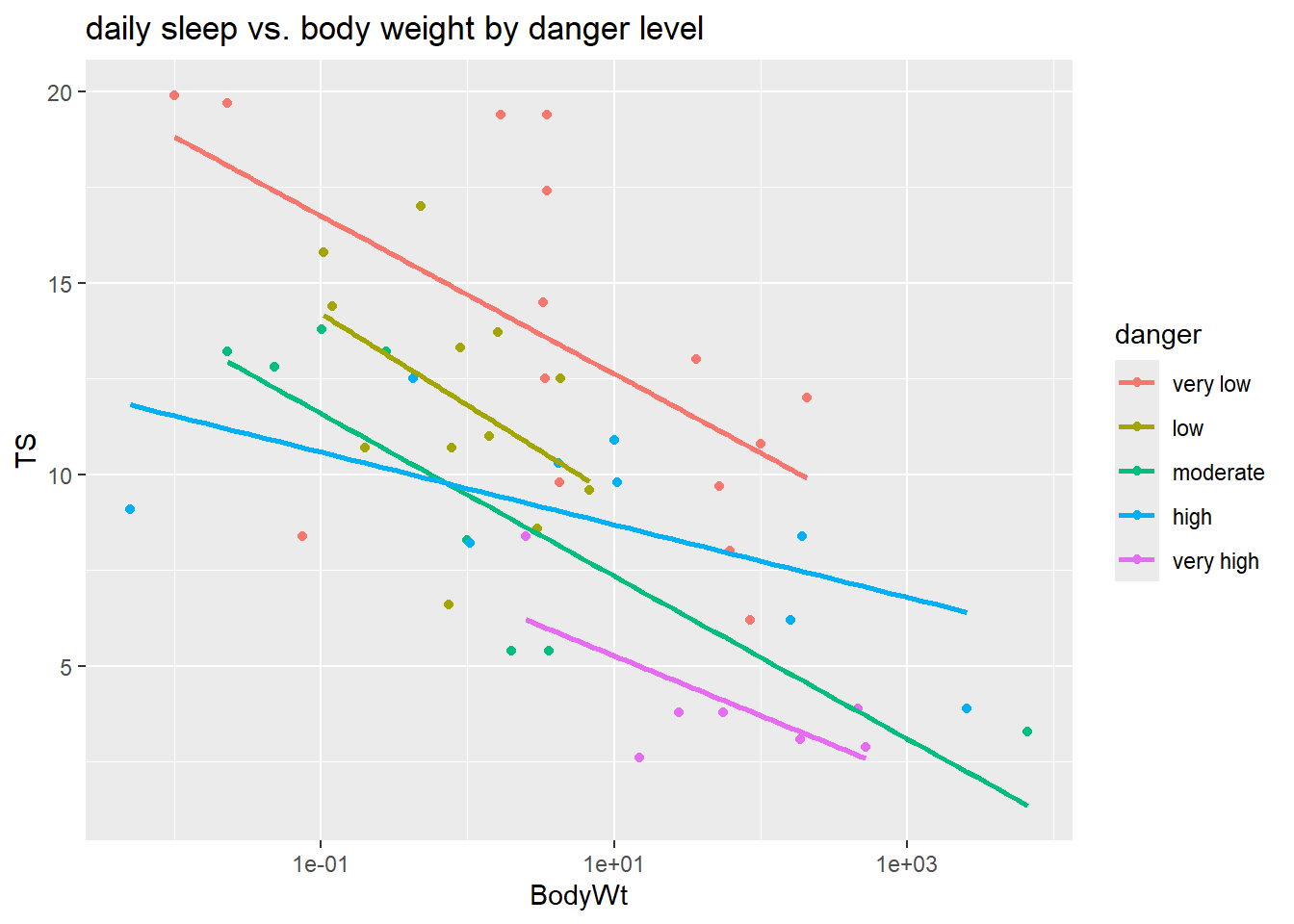
We can’t answer this with individual t-tests which only compare the slopes (effects of body weight) of danger levels two at a time. An F-test can address this question. We will test a model with no interaction to the full model with an interaction: \[\begin{split} H_0: \mu(TS \mid body, danger) &= \beta_0 + \beta_1 \log(body) + \beta_2 low + \beta_3 moderate + \beta_4 high + \beta_5 veryhigh \end{split} \] vs. \[\begin{split} H_A: \mu(TS \mid body, danger) &= \beta_0 + \beta_1 \log(body) + \beta_2 low + \beta_3 moderate + \beta_4 high + \\ & \beta_5 veryhigh + \beta_6 \log(body)low + \beta_7 \log(body)moderate + \\ & \beta_8 \log(body)high + \beta_9 \log(body)veryhigh \end{split} \]
The ANOVA command above gives the results for this hypothesis test because the interaction, with 4 terms in it, was added last in the lm command. The results are in the row for the interaction term log(BodyWt):danger. It compares the extra SS for adding the interaction (which has 4 terms in it!) to the full model:
\[
F = \dfrac{21.56/4}{2.998^2} = 0.5997
\]
and the p-value is
\[
P(F_{4,41} \geq 0.5997) = 1-pf(0.5997, 4, 41) = 0.6649
\]
## [1] 0.6649485The command anova(my_lm) will only give valid F-test results for the last term added in the lm. The other F-tests shows aren’t valid because they aren’t using the correct full model SD estimate (e.g. the denomiator is wrong).
Another use of the anova command is to compare a reduced and full lm fit: anova(reduced_lm, full_lm). Here we fit the reduced model without an interaction term then compare it to the full interaction model:
## Analysis of Variance Table
##
## Model 1: TS ~ log(BodyWt) + danger
## Model 2: TS ~ log(BodyWt) * danger
##   Res.Df    RSS Df Sum of Sq      F Pr(>F)
## 1     45 389.98
## 2     41 368.42  4    21.556 0.5997 0.6649
Here we get the \(SSR\) values for both models, the extra SS for the added terms (21.56), the F-test statistic (0.5997) and the p-value (0.6649).
Conclusion: Even though we see some different between the effect of body weight in the high danger level, compared to other levels, these overall differences is slopes aren’t statistically significant after accounting for danger level and body weight.
3.6.4.3 \(R^2\) and \(R^2_a\)
As you can see at the top of this example section, the summary function gives both coefficient estimates and ANOVA info about the overall F-test and \(R^2\) values. The broom package’s glance function isolates just the model fit info like \(R^2\) and the overall \(F-\) test:
## # A tibble: 1 × 12
##   r.squared adj.r.squared sigma statistic     p.value    df logLik   AIC   BIC
##       <dbl>         <dbl> <dbl>     <dbl>       <dbl> <dbl>  <dbl> <dbl> <dbl>
## 1     0.663         0.590  3.00      8.98 0.000000250     9  -123.  268.  289.
## # ℹ 3 more variables: deviance <dbl>, df.residual <int>, nobs <int>## # A tibble: 1 × 12
## r.squared adj.r.squared sigma statistic p.value df logLik AIC BIC
## <dbl> <dbl> <dbl> <dbl> <dbl> <dbl> <dbl> <dbl> <dbl>
## 1 0.644 0.604 2.94 16.3 0.00000000381 5 -124. 262. 276.
## # ℹ 3 more variables: deviance <dbl>, df.residual <int>, nobs <int>The larger model, sleep_lm, will have the larger \(R^2\) value. The model with the interaction will explain about 66.3% of the variation in total sleep while the model without the interaction explains about 64.4% of the variation in total sleep. But are these 4 extra interaction terms worth it to gain only 1.9% more explanatory power? The adjusted \(R^2\) for the smaller model is 0.604 which is a larger value than adjusted \(R^2\) for the larger model (0.590). This, along with our F-test above, indicates that the interaction terms don’t add sufficient information about the response when the other two terms (danger level and body weight) are already included in the model.
3.7 Model Checking
After fitting a potential MLR model to a data set, we use residuals to help diagnosis any issues in the “fit” of our model. I.e. are any of our MLR model assumptions violated. We can also use residuals, along with a other measures, to determine if there are any cases that could be influencing our model fit.
Timing: You should always check model fit and outliers affects before any model testing or interpretation! Even though this section is after all our inference sections, you need to make sure your choice of model doesn’t violate our model assumptions. Using an ill-fitting model to determine which predictors are “statistically significant” or how they change the mean function is irrelevant if the model is not correctly specified, or if an outlier or two is seriously influencing the model fit.
We will use the same methods as SLR to check the model assumptions of independence (Section 2.9.4) and normality of errors (Section 2.9.3) and when the model is robust (or not) against violations (Section 2.9.5
3.7.1 Residual plots
Residual plots for MLR were first discussed in Section 3.3.3 and they are used to check the linearity and constant variance MLR model assumptions.
We typically look at \(p+1\) plots: residuals vs. \(\hat{y}_i\) and residuals vs. all \(p\) predictors. (Here, \(p\) tells us how many predictors are in the model, terms like interactions are not used to produce residual plots.)
3.7.1.1 Example: Sleep
Let’s revisit our sleep example first introduced in Section 3.4.2.1. Let’s now consider all predictors and fit the regression of total sleep (TS) on log of body weight (BodyWt), danger level (danger), brain weight (BrainWt), life span (Life), and gestational period (GP). (Note: GP measures the pregnancy time length for a species).
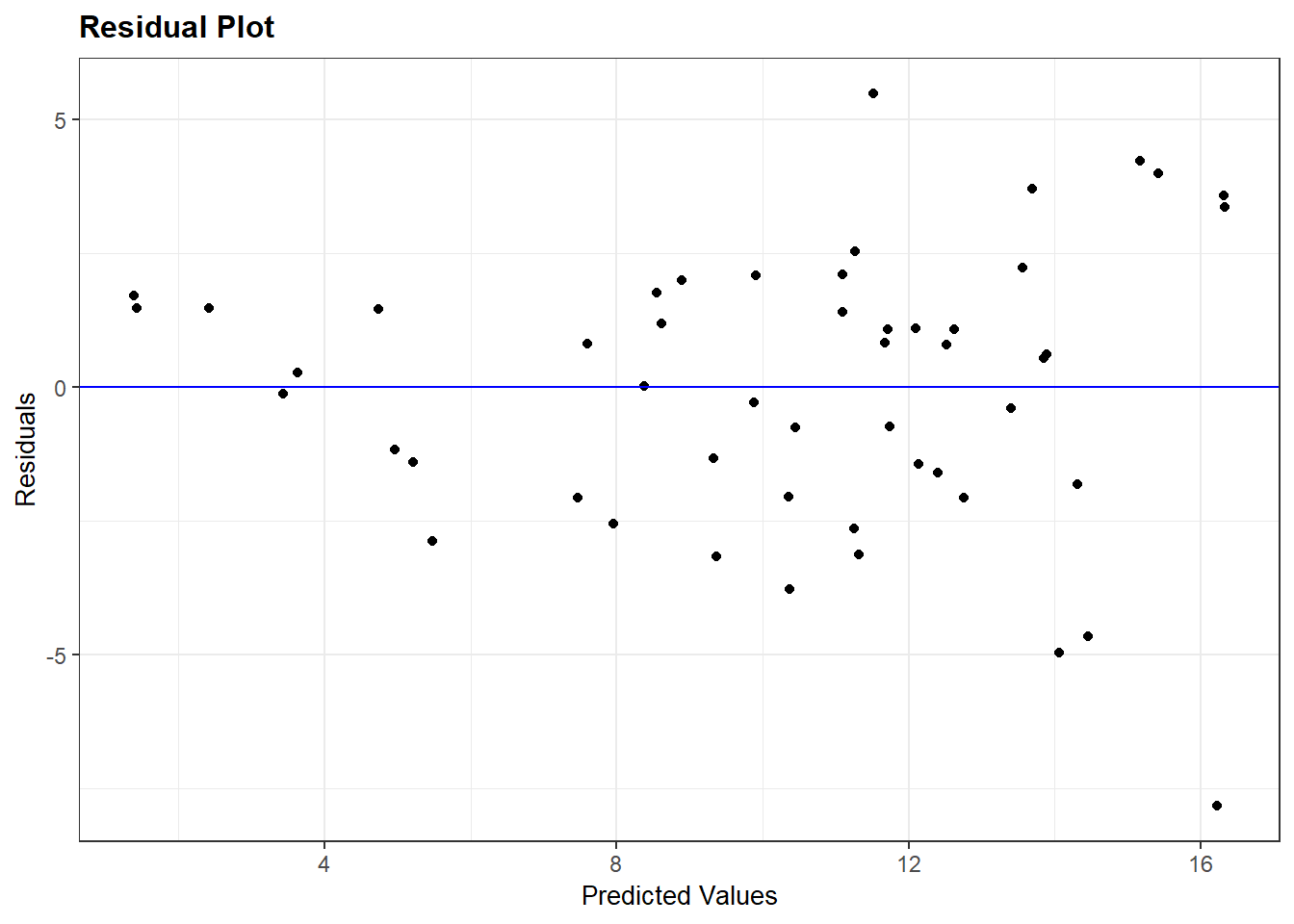
Recall that plot(my_lm, which=1) gives the residuals vs. fitted values. For the regression of total sleep on (log) body weight, life span and danger level (Section 3.6.4), the residual vs. fitted plot is:
We can also use ggResidpanel functions to get the fitted and predictor plots:
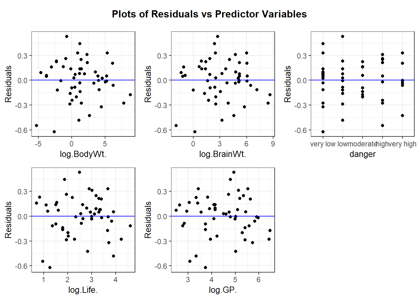
Conclusion: The mean function linearity assumptions is questionable in the fitted residual plot (lower fitted TS values all have positive residuals). There are also some concerns about the constant variance assumption:
- for low fitted values (low predicted total sleep), we see less variation in residuals than for high fitted values.
- we see less variation in residuals for high levels of the explanatory variables. Note that from EDA, we see that the association between these predictors and total sleep are negative, meaning these high values of predictors correspond to the low fitted values for predicted sleep.
At this stage, we should consider an alternative model version. After some trial and error with transformations, using the log of all quantitative variables leads to improved residual plots. This is our new version of sleep_lm3
sleep_lm3 <- lm(log(TS) ~ log(BodyWt) + log(BrainWt) + danger + log( Life) + log(GP), data = sleep)
resid_panel(sleep_lm3, plots = c("resid", "qq"))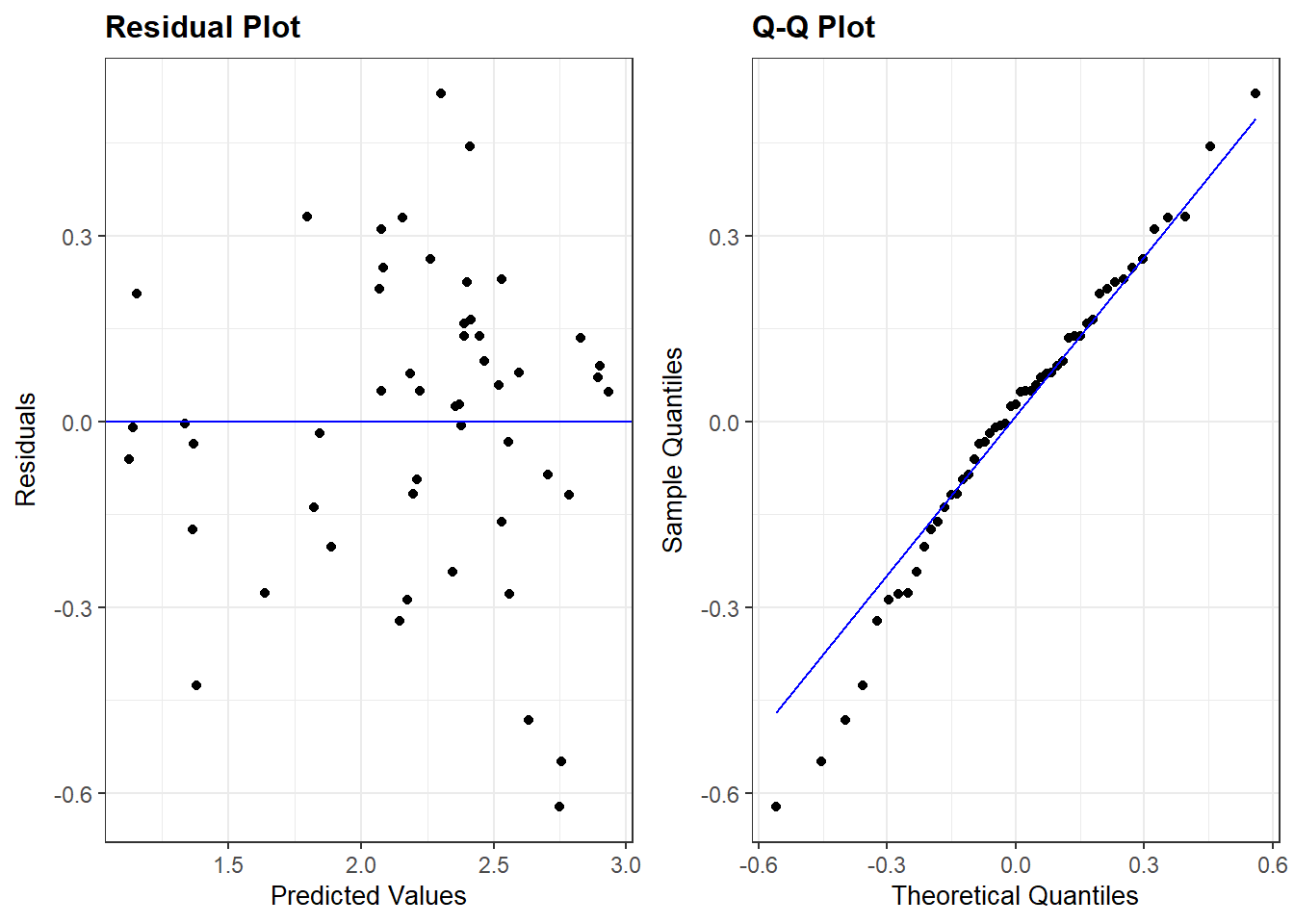
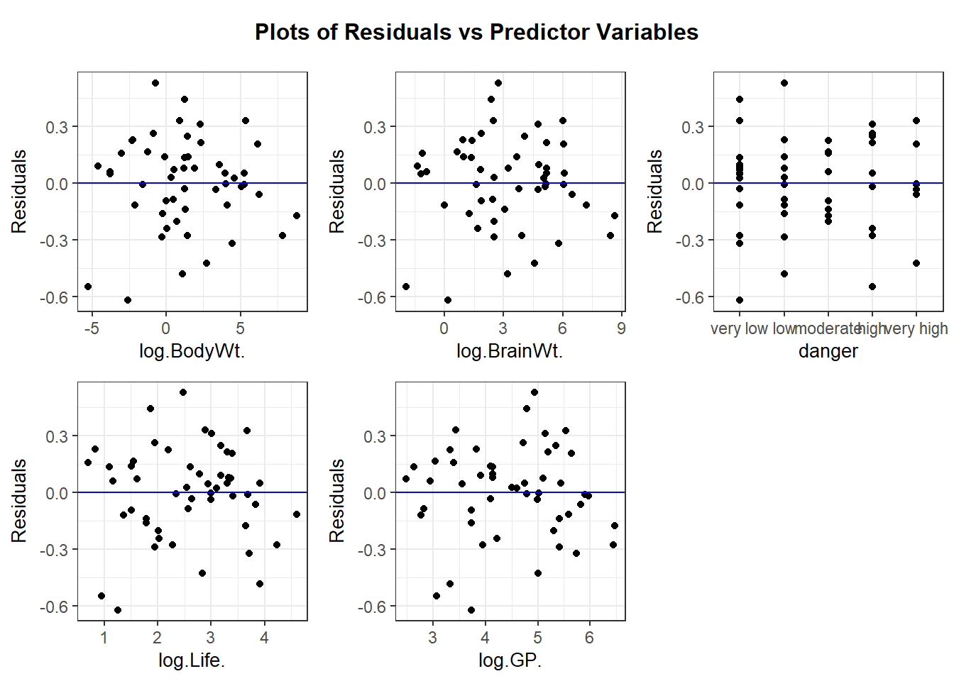
Overall, these residual plots look “better” than before. It looks like the model that best meets our MLR linearity and constant variance assumptions. The normality assumption is violated (see the QQ plot above), but with around 50 cases we should be able to trust inferences that involve the mean function (but not prediction intervals). Independence would only be violated if there were predator-prey relationships that would cause a correlation in total sleep among certain groups of species.
3.7.2 Outliers
When analyzing one variable, a case that is “far enough” from the mean or median of that variable’s distribution could be deemed “unusual” and called an outlier. In regression modeling, we need to broaden this notion of “unusual” or outlying cases because we have more than one variable involved. There are three common statistics used to measure the “unusualness” of a case: leverage, standardized residual, and Cook’s distance. These are all examples of case influence statistics.
3.7.2.1 Leverage
Leverage is a statistic that assesses how unusual a case’s predictor values are compared to average predictor values for all cases. This statistic doesn’t consider a case’s response at all.
For SLR, the leverage of case \(i\) equals \[ h_i = \dfrac{1}{n-1}\left(\dfrac{x_i - \bar{x}}{s_x}\right)^2 + \dfrac{1}{n} \] This basically measures how far \(x_i\) is from the mean predictor value, a larger deviation means higher leverage. In the plots below for a SLR model, we see an “outlier” in red in all three scatterplots of \(y\) vs. \(x\). But only when the red case has an extreme predictor value (along the \(x\)-axis) will it have high leverage (shown in the bottom plots). The first case will have a large residual but not a large leverage value.
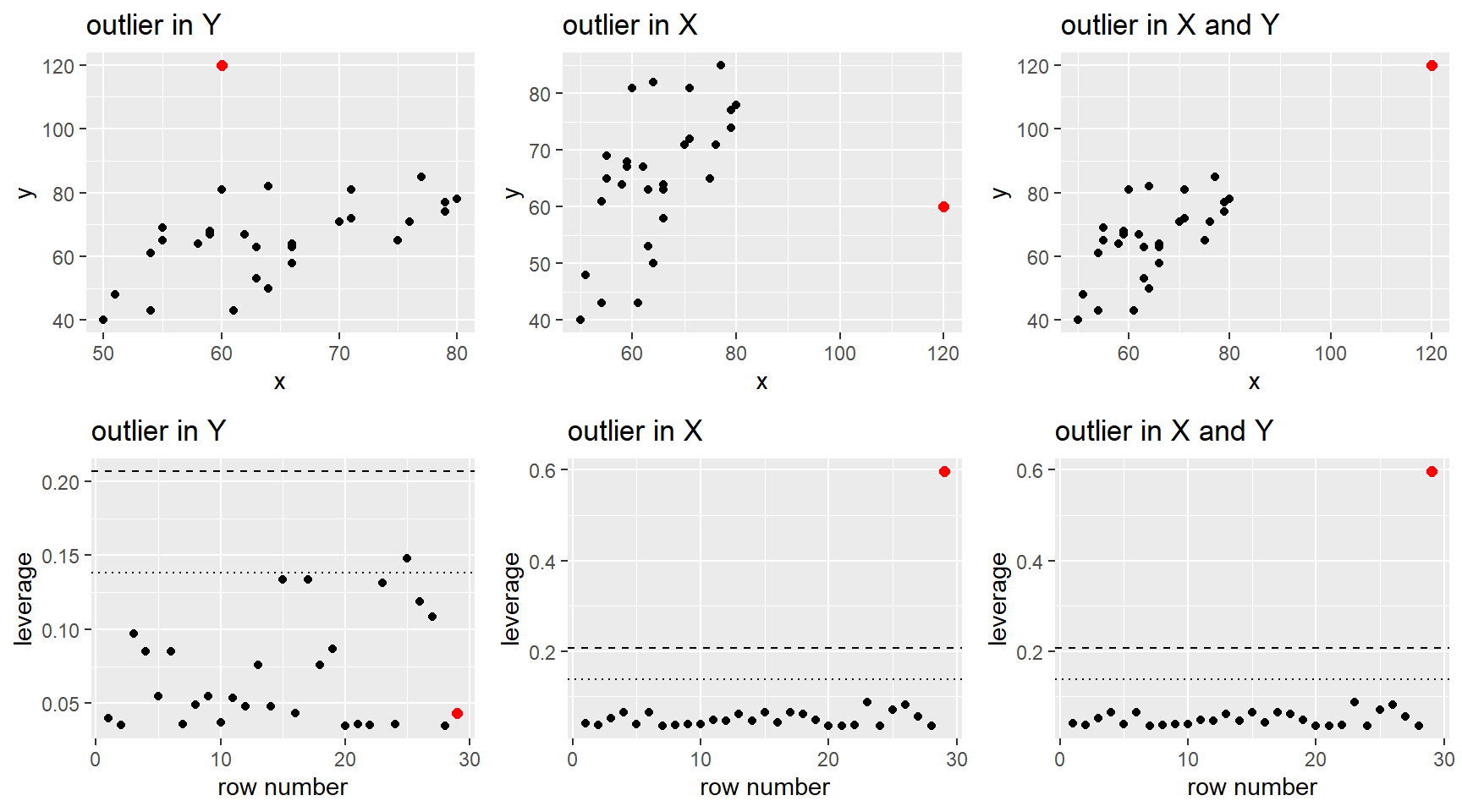
In a MLR model, with more than one predictor, leverage \(h_i\) is computed in the same spirit as the SLR formula but using matrix algebra to measure how far a case’s predictor values are from the main “point cloud” of predictor values. Visualizing points with large leverage is harder because we are usually only using 2-dimensional graphs. The plots below show scatterplots for a regression with two predictors, \(x_1\) and \(x_2\). In all three cases the outlier point in red is a similar distance to the “middle” of the point cloud (shown by the green triangle). Because of this, all three cases have roughly the same leverage value (bottom graphs).
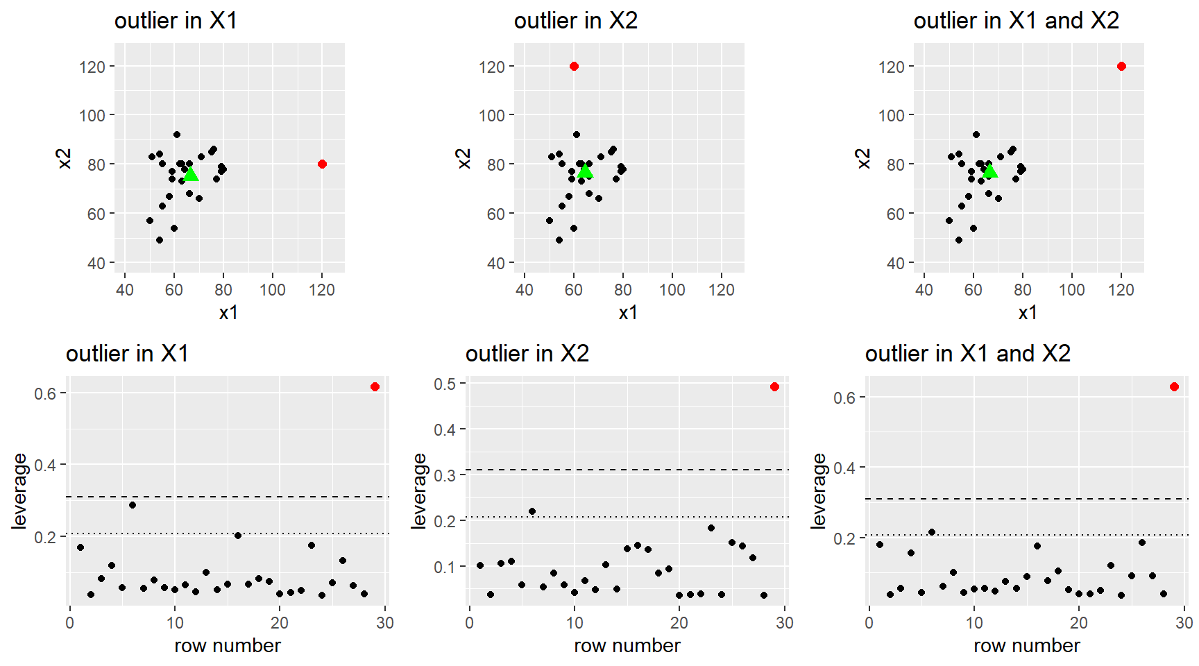
Mathematically:
- \(\dfrac{1}{n} \leq h_i < 1\)
- average leverage across all cases is \(\bar{h} = (p+1)/n\).
Guidelines for “large” leverage are based on the average leverage value:
- \(h_i > 2(p+1)/n\): potential for some influence
- \(h_i > 3(p+1)/n\): potential for large influence
Why care about leverage? A case with high leverage has the potential to be influential in the regression the fit of the regression line or surface. A regression line/surface could be pulled towards cases with high leverage. This is due to the fact that the SE of each observed residual \(r_i = y_i - \hat{y}_i\) is inversely related to leverage: \[ SE(r_i) = \hat{\sigma}\sqrt{1-h_i} \] This SE tells us how much variability we will see in case \(i\)’s residual when computing the residual for case \(i\) for many, many regression fits from many, many sample responses taken from a population with predictor values fixed. (Think back to the SLR simulation in Chapter 2.)
- A case with \(h_i \approx 1\), means that it’s residual has little variability and all possible regression lines/surfaces will result in \(\hat{y_i}\) being very close to \(Y_i\) (since the expected value of each residual is 0).
- If \(Y_i\) for case \(i\) is not following the “trend” of the other \(n-1\) cases, then this case will be very influential on where the estimated regression line/surface goes.
- A case with \(h_i \approx 1/n\), means that if \(n\) is large, it’s residual has variability of about \(\sigma\) and all possible regression lines/surfaces will result in \(\hat{y_i}\) that can vary widely from \(Y_i\).
3.7.2.2 Standardized (internally studentized) residuals
Standardized residuals, also known as internally studentized residuals, are the ratio of a residual to its SE: \[ studr_i = \dfrac{r_i}{SE(r_i)} = \dfrac{y_i - \hat{y}_i}{\hat{\sigma}\sqrt{1-h_i}} \]
The reasons for a case with a large standardized residual are
- a large \(r_i\) value (just poorly predicted) but “regular” leverage value. These cases will have typical predictor values but an unusual response.
- a “regular” \(r_i\) value but a small SE due to a large leverage value.
If our normality model assumption holds, then these standardized residuals should behave, roughly, like standard normal values (N(0,1)). Guidelines to flag unusual cases are
- \(| studr_i| > 2\) for smaller data sets
- \(| studr_i| > 4\) for large data sets
In the plots below we see
- Y outlier: This red case has a very large residual value \(r_i\) but it doesn’t have high leverage. The extremely high residual value leads to a large standardized residual value.
- X outlier: This red case has a large negative standardized residual due to its large residual value and small SE (due to large leverage, shown above).
- X and Y outlier: The left case doesn’t have an unusual standardized residual value because though it has large leverage (shown above), its residual is still small (because it follows the trend of the other cases). The right case has the same leverage as the left case, but this time it has a larger residual because it deviates a bit from the overall trend. For this reason, the right case has a larger standardized residual than the left case.
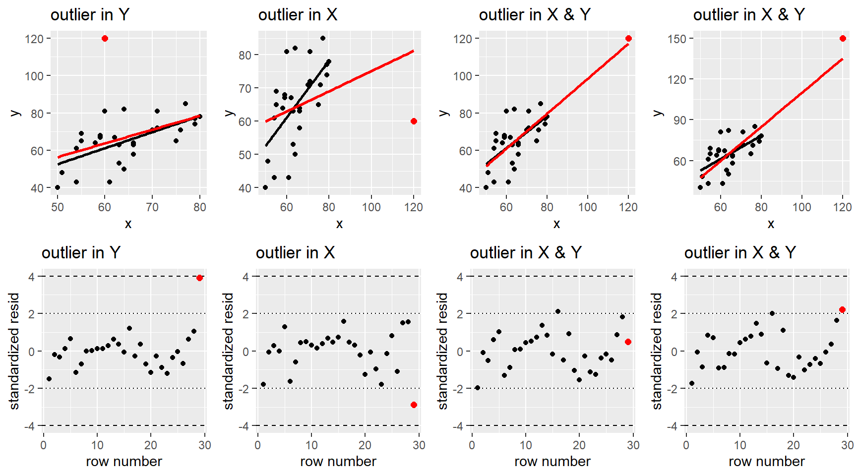
3.7.2.3 Cook’s distance
Cook’s distance, \(D_i\), is a measure of a case’s influence on the fitted regression line/surface. It is computed for case \(i\) by removing case \(i\) from the data, then fitting a regression model and predicting responses for all cases \(\hat{Y}_{j(-i)}\). These “remove \(i\)” predictions are compared to the predictions we get when including case \(i\), \(\hat{Y}_i\). If these two predictions deviate a lot, overall all cases, then we would say that case \(i\) is influential in the regression fit. \[ D_i = \sum_{j=1}^n \dfrac{(\hat{Y}_{j(-i)} - \hat{Y}_{j})^2}{(p+1)\hat{\sigma}^2} = \dfrac{studr^2_i}{p+1} \dfrac{h_i}{1-h_i} \] Note in the equation above shows that the measure of the “remove \(i\)” predictions from overall predictions can be expressed in terms of a cases’s leverage and standardized residual. A case can have high Cook’s distance if it has high standardized residual, high leverage, or a combination of both. A case should be flagged as likely influential if is has a Cook’s distance for 1 or larger.
In the plots below, the red regression line was fit including the red point and the black line was fit without the red point. A case where the red and black lines deviate a lot means that the red point in influential.
- Y outlier: This red case has a very large residual value \(r_i\) but it doesn’t have high leverage. It is not very influential.
- X outlier: This red case has a large negative standardized residual and large leverage, so it is very influential (\(D_i \approx 6\)).
- X and Y outlier: The left case doesn’t have an unusual standardized residual value though it has large leverage, so it isn’t very influential because it follows the trend of the other cases. The right case has the same leverage as the left case, but this time it has a larger standardized residual than the left case and it is deemed to be influential (\(D_i > 3\)).
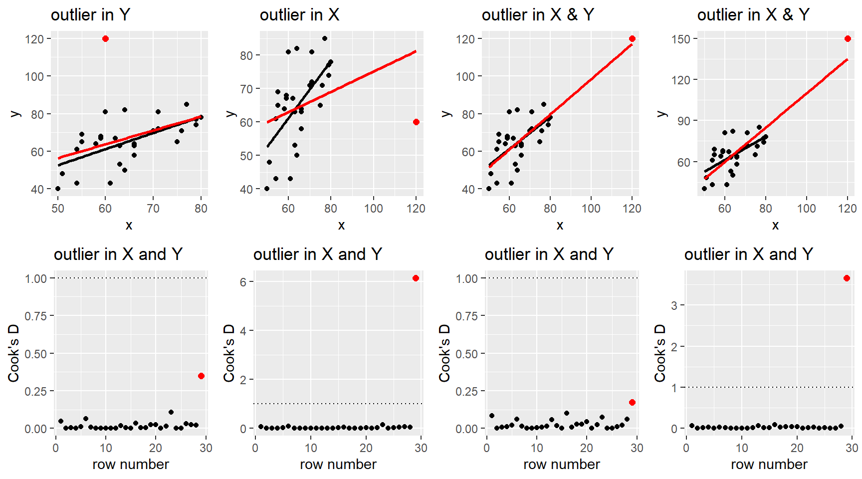
3.7.2.4 Example: Sleep
In Section 3.7.1.1, we fit sleep_lm3 which is the regression of total sleep on all predictors in the data with quantitative variables on the log-scale.
##
## Call:
## lm(formula = log(TS) ~ log(BodyWt) + log(BrainWt) + danger +
##     log(Life) + log(GP), data = sleep)
##
## Coefficients:
##     (Intercept)      log(BodyWt)     log(BrainWt)        dangerlow
##         3.37184         -0.02768         -0.02285         -0.15528
##  dangermoderate       dangerhigh  dangervery high        log(Life)
##        -0.44160         -0.23741         -0.94277          0.04862
##         log(GP)
##        -0.20074
We can use the plot(my_lm, which = 4) command to plot Cook’s distance against row number. Adding id.n=5 will tell R to identify the row number of the 5 largest Cook’s distance cases. Note that this is just a tool for identifying cases, it doesn’t mean that they are influential cases if their values are all well below 1.
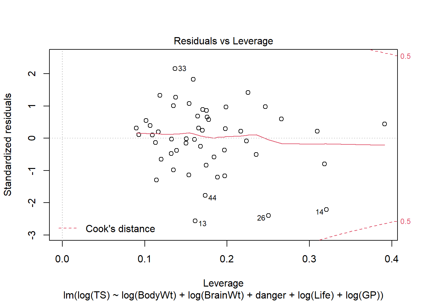
We can use the plot(my_lm, which = 5) command to plot standardized residuals (y-axis) against leverage (x-axis) with contours given by Cook’s distance.
The ggResidpanel package also provides these plots (cookd and lev) using resid_panel or resid_interact. The latter will let you interactively hover over points that you would like to identify. The horizontal line in the Cook’s distance plot is set at \(4/n\). (Note that interact plots only work when knitting a Markdown doc to HTML!)
For this model fit, we have one case (13) with standardized residual close to -3 but this case has a leverage value in the middle of all other cases. Case 13 also has the third largest Cook’s distance value (0.141) but all Cook’s distances are well below 0.5. The second largest Cook’s distance case, 26, has a higher leverage value and a standardized residual around -2.4. Case 14 has the highest Cook’s distance value (around 0.25) and higher leverage and standardized residual values.
The three cases that have the highest Cook’s distance are rows 13, 14, and 26. These three cases all have standardized residuals between -2 and -3. The cases with the largest leverage values are rows 27, 14 and 1.
| Species | TS | BodyWt | BrainWt | Life | GP | D | danger |
|---|---|---|---|---|---|---|---|
| Eastern_American_mole | 8.4 | 0.075 | 1.20 | 3.5 | 42.0 | 1 | very low |
| Echidna | 8.6 | 3.000 | 25.00 | 50.0 | 28.0 | 2 | low |
| Lesser_short-tailed_shrew | 9.1 | 0.005 | 0.14 | 2.6 | 21.5 | 4 | high |
| Little_brown_bat | 19.9 | 0.010 | 0.25 | 24.0 | 50.0 | 1 | very low |
| African_elephant | 3.3 | 6654.000 | 5712.00 | 38.6 | 645.0 | 3 | moderate |
So why do these cases stand out in terms of these case influence stats? We can make the augmented data frame use the broom command augment to see the case influence stat values for cases. Remember what these stats measure:
High leverage: case has extreme predictor value(s). One way to investigate this is to look at leverage vs. predictor variables. In augmented data, the
.hatvariable records the leverage for each case.High standardized residual: case has poorly predicted and/or has high leverage. In the augmented data, the
.std.residrecords the standardized residual for each case.High Cook’s distance: case has high leverage and/or high standardized residual
library(broom)
sleep_aug_lm3 <- augment(sleep_lm3, data = sleep)
sleep_aug_lm3 %>%
  select(-D, -.sigma, -.fitted) %>%  #omit some augmented variables
  slice(13, 14, 26, 27, 1) %>%
  arrange(desc(.cooksd)) # report in descending order according to cook's D
## # A tibble: 5 × 11
## Species TS BodyWt BrainWt Life GP danger .resid .hat .cooksd
## <chr> <dbl> <dbl> <dbl> <dbl> <dbl> <fct> <dbl> <dbl> <dbl>
## 1 Echidna 8.6 3 e+0 25 50 28 low -0.482 0.321 0.257
## 2 Lesser_short-t… 9.1 5 e-3 0.14 2.6 21.5 high -0.548 0.250 0.212
## 3 Eastern_Americ… 8.4 7.5 e-2 1.2 3.5 42 very … -0.622 0.161 0.141
## 4 African_elepha… 3.3 6.65e+3 5712 38.6 645 moder… -0.174 0.318 0.0329
## 5 Little_brown_b… 19.9 1 e-2 0.25 24 50 very … 0.0905 0.391 0.0137
## # ℹ 1 more variable: .std.resid <dbl>We could use our augmented data frame to plot the case influence stats against predictor variables, but the R package GGally has plotting options for case influence stats plotted against predictor variables. Reference lines for leverage (.hat) are average leverage and twice average leverage.
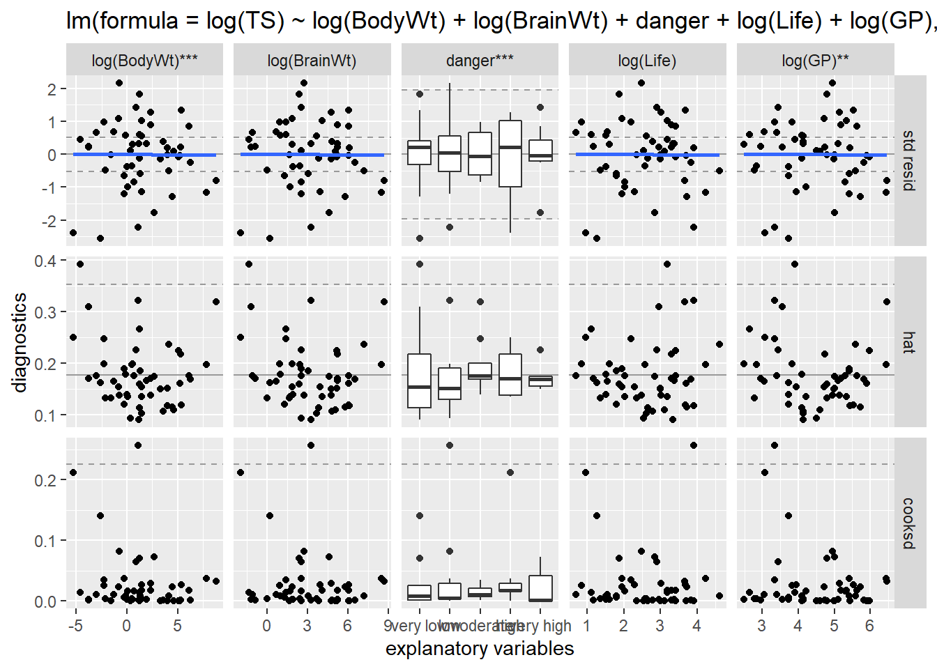
Here we remove the SE ribbon and smoother from the standardized residual plot. (Here, the smoother is replaced by the “lm” fit of the residual plot, which is just a horizontal line at 0.)
ggnostic(sleep_lm3, columnsY = c(".std.resid", ".hat", ".cooksd"),
         continuous = list(.std.resid = wrap("nostic_resid", se = FALSE, method = "lm")))
We can use the GGally plots of case influence stats against predictors to help us understand the characteristics of cases that have concerning case influence stats. For example, the smallest body weight case, 0.005kg, corresponds to the second highest high Cook’s distance value (Lesser short-tailed shrew, row 26). This shrew (case 26) has the second highest Cook’s distance a higher leverage value, in part because it also has one of the smallest life spans of 2.6 (min life span is 2).
##      BodyWt              Life
##  Min.   :   0.005   Min.   :  2.00
##  1st Qu.:   0.615   1st Qu.:  6.25
##  Median :   3.385   Median : 14.00
##  Mean   : 224.363   Mean   : 20.15
##  3rd Qu.:  44.245   3rd Qu.: 27.50
## Max. :6654.000 Max. :100.00## # A tibble: 1 × 14
## Species TS BodyWt BrainWt Life GP D danger .fitted .resid .hat
## <chr> <dbl> <dbl> <dbl> <dbl> <dbl> <int> <fct> <dbl> <dbl> <dbl>
## 1 Lesser_sho… 9.1 0.005 0.14 2.6 21.5 4 high 2.76 -0.548 0.250
## # ℹ 3 more variables: .sigma <dbl>, .cooksd <dbl>, .std.resid <dbl>Why does case 14, the echidna, have the highest Cook’s distance value? It has to do with a combination of higher leverage and higher residual value (shown in the interactive plot above). Higher residual value means this species sleep time is poorly predicted. Higher leverage means it has an unusual predictor value(s) or combination of predictor values. The ggnostic plot above (bottom row) shows that this highest Cook’s distance case has body and brain values in the middle of the pack, but it one of the higher life space values and one of the lower gestational period values. In fact, the EDA below shows that the echidna has an unusually long life span given its short gestational period (or, an unusually low gestational period given its long life span).
##        GP             Life
##  Min.   : 12.0   Min.   :  2.00
##  1st Qu.: 42.0   1st Qu.:  6.25
##  Median :100.0   Median : 14.00
##  Mean   :142.1   Mean   : 20.15
##  3rd Qu.:205.0   3rd Qu.: 27.50
## Max. :645.0 Max. :100.00## # A tibble: 1 × 14
## Species TS BodyWt BrainWt Life GP D danger .fitted .resid .hat
## <chr> <dbl> <dbl> <dbl> <dbl> <dbl> <int> <fct> <dbl> <dbl> <dbl>
## 1 Echidna 8.6 3 25 50 28 2 low 2.63 -0.482 0.321
## # ℹ 3 more variables: .sigma <dbl>, .cooksd <dbl>, .std.resid <dbl>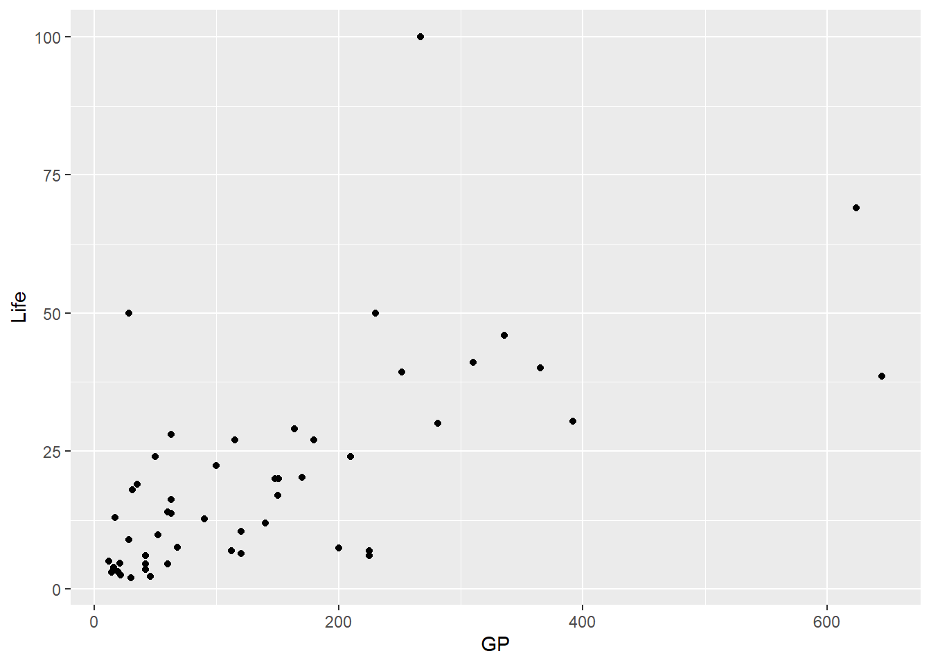
The little brown bat (case 27), has the highest leverage value due to its smaller body size (body and brain weight) and higher life span. So why doesn’t this high leverage case also have a high Cook’s distance? It is due to the fact that it has a smaller residual value, meaning that while it has higher leverage, it still fits the trend of the rest of the data and is not overly influential in pulling the regression surface towards it.
##      BodyWt            BrainWt             Life
##  Min.   :   0.005   Min.   :   0.14   Min.   :  2.00
##  1st Qu.:   0.615   1st Qu.:   4.50   1st Qu.:  6.25
##  Median :   3.385   Median :  21.00   Median : 14.00
##  Mean   : 224.363   Mean   : 317.50   Mean   : 20.15
##  3rd Qu.:  44.245   3rd Qu.: 172.00   3rd Qu.: 27.50
## Max. :6654.000 Max. :5712.00 Max. :100.00## # A tibble: 1 × 14
## Species TS BodyWt BrainWt Life GP D danger .fitted .resid .hat
## <chr> <dbl> <dbl> <dbl> <dbl> <dbl> <int> <fct> <dbl> <dbl> <dbl>
## 1 Little_bro… 19.9 0.01 0.25 24 50 1 very … 2.90 0.0905 0.391
## # ℹ 3 more variables: .sigma <dbl>, .cooksd <dbl>, .std.resid <dbl>We can remove a case(s) from a lm fit by either creating a data frame without the case(s) or by using the subset command in the lm fit: lm(y ~ x, data = , subset = -c(row numbers)). This second option is quick and easy for comparing model fits with and without a case. Here we remove row 14 (echidna, highest Cook’s distance) by updating our original model with a subset command to omit row 14:
##
## Call:
## lm(formula = log(TS) ~ log(BodyWt) + log(BrainWt) + danger +
##     log(Life) + log(GP), data = sleep)
##
## Residuals:
##      Min       1Q   Median       3Q      Max
## -0.62175 -0.12816  0.02809  0.14888  0.53014
##
## Coefficients:
##                 Estimate Std. Error t value Pr(>|t|)
## (Intercept)      3.37184    0.24321  13.864  < 2e-16 ***
## log(BodyWt)     -0.02768    0.04569  -0.606  0.54786
## log(BrainWt)    -0.02285    0.06877  -0.332  0.74133
## dangerlow       -0.15528    0.10837  -1.433  0.15930
## dangermoderate  -0.44160    0.12807  -3.448  0.00130 **
## dangerhigh      -0.23741    0.11719  -2.026  0.04916 *
## dangervery high -0.94277    0.12776  -7.379 4.19e-09 ***
## log(Life)        0.04862    0.07280   0.668  0.50788
## log(GP)         -0.20074    0.06249  -3.212  0.00253 **
## ---
## Signif. codes:  0 '***' 0.001 '**' 0.01 '*' 0.05 '.' 0.1 ' ' 1
##
## Residual standard error: 0.2645 on 42 degrees of freedom
## Multiple R-squared:  0.7973, Adjusted R-squared:  0.7587
## F-statistic: 20.65 on 8 and 42 DF, p-value: 2.955e-12##
## Call:
## lm(formula = log(TS) ~ log(BodyWt) + log(BrainWt) + danger +
## log(Life) + log(GP), data = sleep, subset = -14)
##
## Residuals:
## Min 1Q Median 3Q Max
## -0.5339 -0.1601 0.0016 0.1489 0.5301
##
## Coefficients:
## Estimate Std. Error t value Pr(>|t|)
## (Intercept) 3.40288 0.23176 14.683 < 2e-16 ***
## log(BodyWt) -0.01667 0.04372 -0.381 0.704975
## log(BrainWt) -0.04004 0.06584 -0.608 0.546487
## dangerlow -0.06162 0.11069 -0.557 0.580795
## dangermoderate -0.37340 0.12532 -2.980 0.004834 **
## dangerhigh -0.20070 0.11260 -1.782 0.082086 .
## dangervery high -0.93367 0.12161 -7.678 1.85e-09 ***
## log(Life) 0.12868 0.07735 1.664 0.103795
## log(GP) -0.25091 0.06325 -3.967 0.000286 ***
## ---
## Signif. codes: 0 '***' 0.001 '**' 0.01 '*' 0.05 '.' 0.1 ' ' 1
##
## Residual standard error: 0.2516 on 41 degrees of freedom
## Multiple R-squared: 0.8209, Adjusted R-squared: 0.7859
## F-statistic: 23.48 on 8 and 41 DF, p-value: 5.303e-13Comparing the model inferences and fit with and without the echidna shows no major changes in our conclusions. The variables Life and GP are slightly stronger effects in the model without the echidna, likely due to the fact that this species has an unusual combo of life span and gestational period. We have a slight reduction in residual sum of squares (\(\hat{\sigma}\) drops from 0.2645 to 0.2516) when the echidna is excluded, which reduces SE’s a bit and increases \(R^2\) a bit. But this fact alone should not justify the removal of this case. We can’t just cherry-pick cases to improve \(R^2\)! Overall, none of the cases have overly concerning case influence stats and removing the echidna doesn’t change our model that much.
So when can we consider excluding a case? Cases can be considered for removal if they change our inference conclusions. If this occurs, then consider:
- Is the case part of a different population compared to all other cases? If yes, then removal of the case is justified.
- If no, does the case have high leverage? If yes, describe how it is different in predictor value(s), remove the case and explain the new restricted predictor range for your model
- If no, then there is no clear path! Report results with and without the case and dig into the data and sampling process to try to understand what makes this case different.
- If no, does the case have high leverage? If yes, describe how it is different in predictor value(s), remove the case and explain the new restricted predictor range for your model
3.8 MLR: Visualizing effects
In SLR, we use a scatterplot to display the relationship between \(y\) and one predictor \(x\) and can see easily see the “effect” of \(x\) on \(y\) via the slope of the fitted regression line.
As shown in Section 3.2.1, the relationship between \(y\) and two predictors \(x_1\) and \(x_2\) can be viewed in a 3-D graphic with the “effect” of each predictor shown with a fitted regression surface. But what if \(p>2\)? And why not just use the scatterplot matrix to see how predictors affect the response in an MLR model? In our regression model, the “effect” of \(x_1\) tells us how changing \(x_1\) changes the mean response, holding all other terms fixed. The scatterplot of \(y\) vs. \(x_1\) does not hold all other terms fixed. In fact, when model terms are related, this scatterplot can give misleading information about how \(x_1\) is related to \(y\) in the MLR model.
3.8.1 Partial residual plots
One tool use can use to see the how \(x_i\) is related to \(y\), holding other model terms fixed, is a partial residual plot. Suppose we have two predictors \(x_1\) and \(x_2\) and we want to understand the form of the mean function: \[ \mu_{y \mid X=x_1, x_2} = ?? \] Let’s assume that the effect of \(x_2\) in this mean function is linear while the form of the relationship with \(x_1\) is described by \(f(x_1)\), then \[ \mu_{y \mid X} = \beta_0 + f(x_1) + \beta_2x_2 \] We can express our unknown function \(f\) in terms of \[ f(x_1) = \mu_{y \mid X} - (\beta_0 + \beta_2x_2) \] To visualize this function with data, we could plot \[ f(x_{1,i}) = Y_i - (\beta_0 + \beta_2x_{2,i}) \] against the predictors \(x_{1,i}\). If \(f(x_1)\) is a linear function, then this plot will be linear. If \(f(x_1)\) is not a linear function, then this plot will not be linear.
In practice, we need to estimate the mean function to compute these “partial” residuals:
- approximate \(f(x_1)\) with a linear function and fit the regression of \(Y\) on \(x_1\) and \(x_2\) to get \[ \hat{\mu}_{y \mid X} = \hat{\beta}_0 + \hat{\beta}_1x_1 + \hat{\beta}_2x_2 \]
- compute the partial residuals for \(x_1\): \[ pres_{1,i} = y_i - (\hat{\beta}_0 + \hat{\beta}_2x_{2,i}) \]
- plot \(pres_{1,i}\) against \(x_1\) to see what the relationship between \(y\) and \(x_1\) looks like after “accounting for \(x_2\)”. The slope of the least squares line in the partial residuals in this plot for \(x_1\) will equal its estimated (linear) effect \(\hat{\beta}_1\) in the MLR of \(y\) on \(x_1\) and \(x_2\).
We get partial residuals for \(x_2\) by adjusting for effects of \(x_1\): \[ pres_{2,i} = y_i - (\hat{\beta}_0 + \hat{\beta}_1x_{1,i}) \]
If we have a larger MLR model, with more terms, then we end up computing partial residuals for term \(x_i\) by adjusting for (substracting off) the effects of all other terms except \(x_i\).
Using partial residual plots:
- We can see the “effect” of \(x_i\) after adjusting for other model terms.
- We can also see the variation in \(y\) that remains after adjusting for other model terms.
- We can look for outliers that could be affecting the estimated effect of \(x_i\)
- We can see if the effect of \(x_i\) is correctly modeled, signs on non-linearity and/or non-constant variance suggest we need to correct our model form.
3.8.2 Example: Sleep
Back to our sleep regression from Section 3.7.2.4. Back to the total sleep example and the regression of total sleep on body weight, brain weight, life span, gestation period (in days) and danger level with all quantitative predictors logged:
##
## Call:
## lm(formula = log(TS) ~ log(BodyWt) + log(BrainWt) + danger +
##     log(Life) + log(GP), data = sleep)
##
## Coefficients:
##     (Intercept)      log(BodyWt)     log(BrainWt)        dangerlow
##         3.37184         -0.02768         -0.02285         -0.15528
##  dangermoderate       dangerhigh  dangervery high        log(Life)
##        -0.44160         -0.23741         -0.94277          0.04862
##         log(GP)
##        -0.20074
The R package car has a function called crp that will plot partial residual plots for any model that doesn’t have an interaction term:
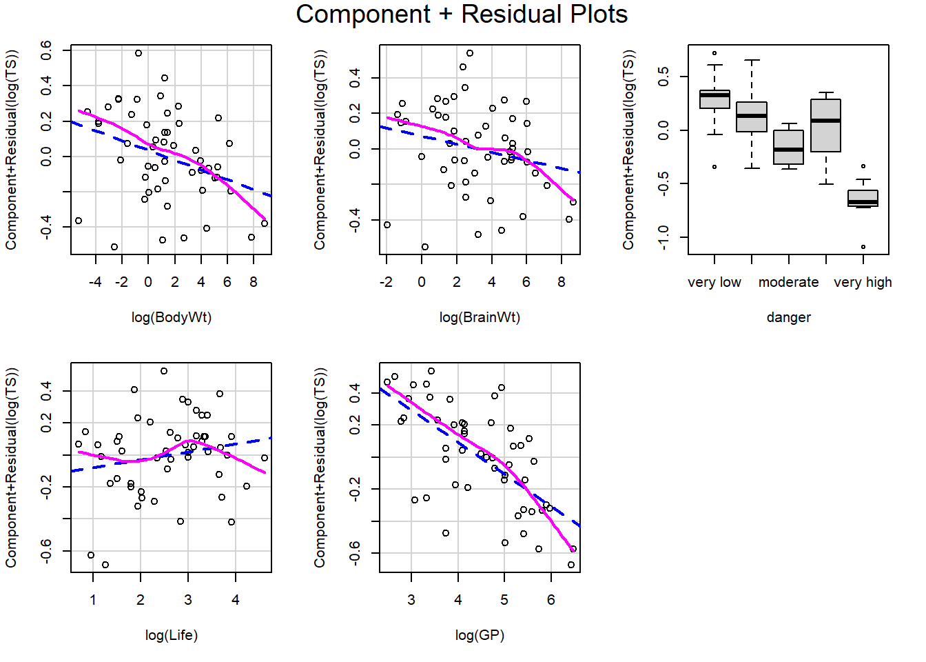 In this package, the values plotted on the y-axis are “Component + Residual” which is computed as the partial residual for the predictor variable of interest, minus the average partial residual value. In this way, they are centered around 0 which makes them “feel” like a usual residual, but the trend in points we observe is the effect of the variable on the response after accounting for all other model variables.
We can change the layout:
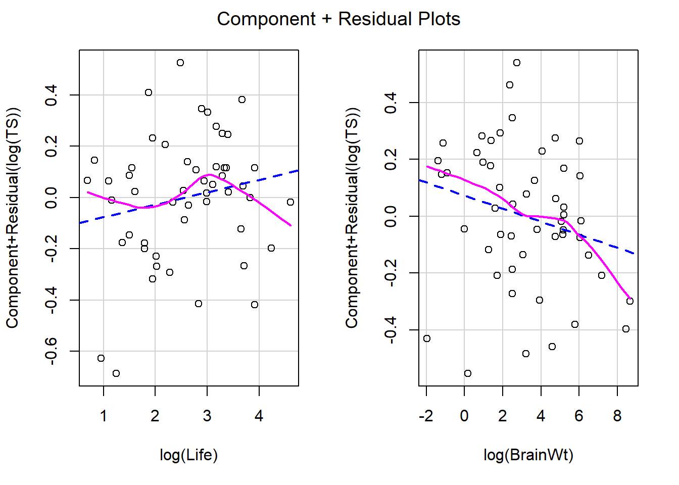
Only plot a subset of terms:
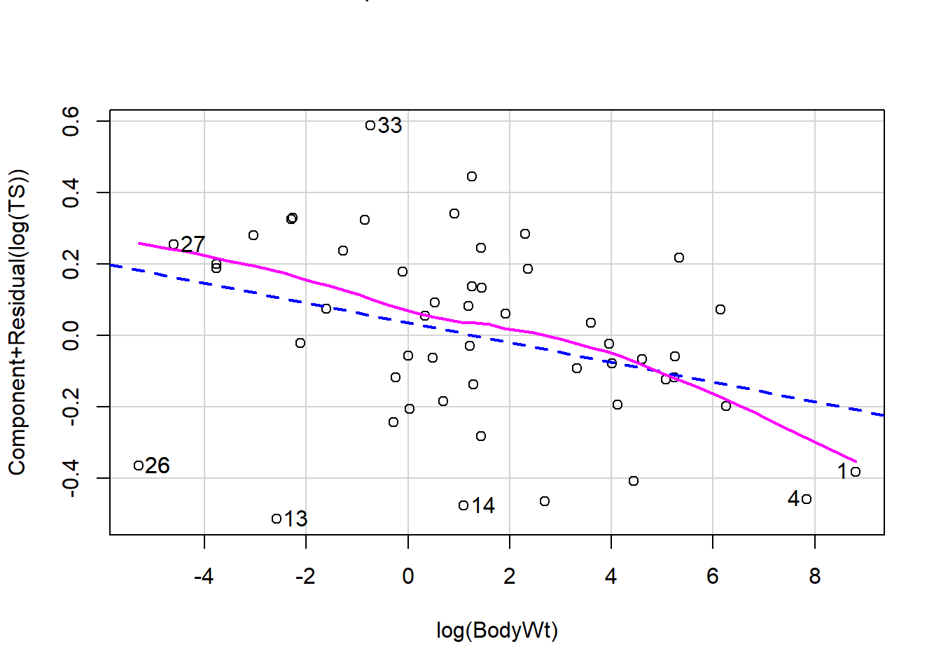
The blue trend like is the least squares fit for each partial residual plot, and the slope of this line is the predictor’s estimated effect. For example, the slope for the log(Life) partial residual plot is 0.0486 and the slope for the log(BodyWt) partial residual plot is -0.0277 (both shown in the output table above).
And identify unusual cases by their row number:
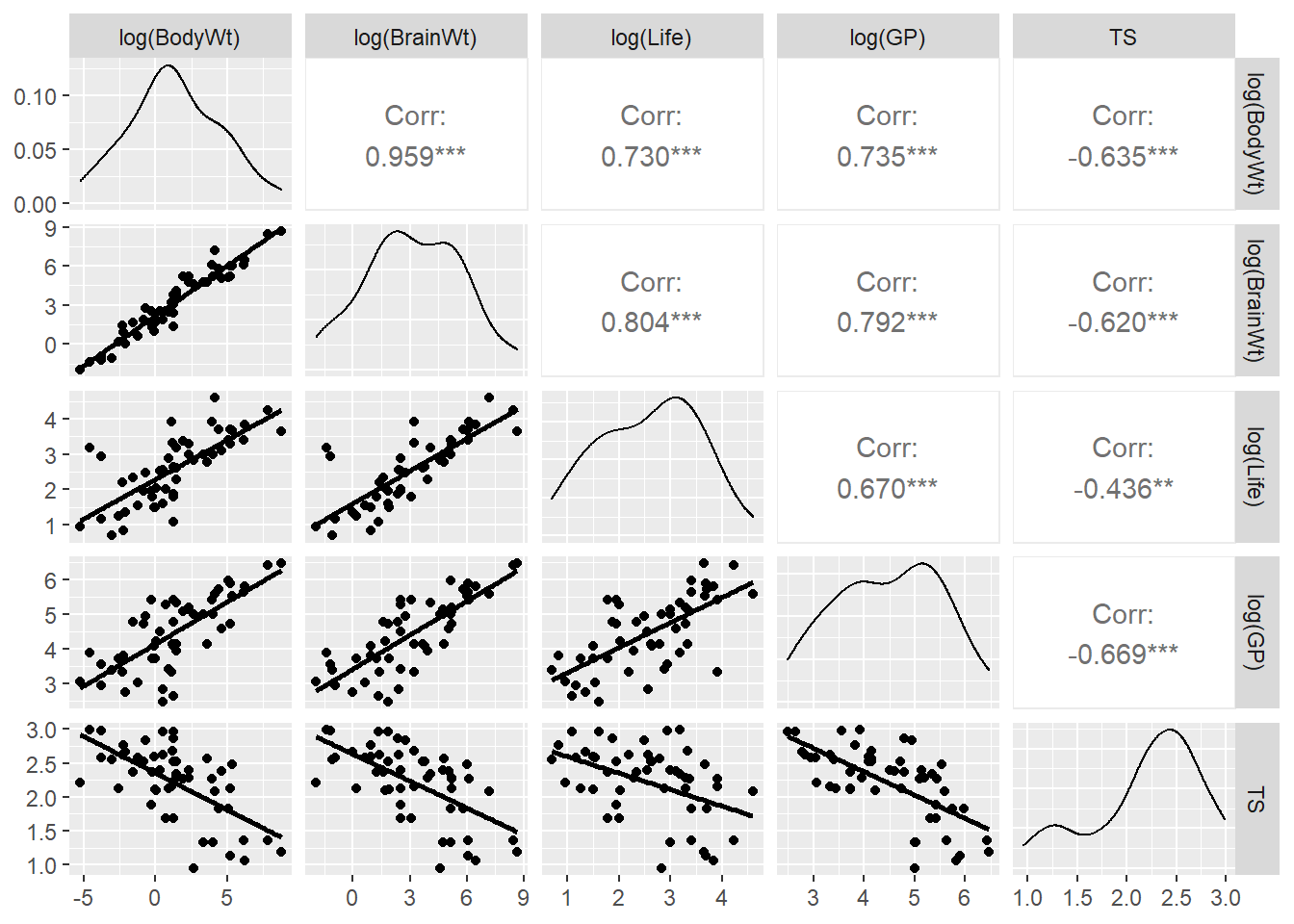
# a few cases with extreme partial residuals
sleep %>% slice(13, 14, 26, 33) %>% select(Species, BodyWt, TS)
## Species BodyWt TS
## 1 Eastern_American_mole 0.075 8.4
## 2 Echidna 3.000 8.6
## 3 Lesser_short-tailed_shrew 0.005 9.1
## 4 Owl_monkey 0.480 17.03.8.2.1 Comparing TS against Life vs. partial plot for Life
TS vs Life: In our initial EDA for Life, we can observe that the scatterplot of TS against Life (both logged) shows a negative relationship between total sleep and life span. As life span gets bigger, total sleep gets smaller, not accounting for any other predictors.
sleep %>%
  mutate_at(.vars = c("BodyWt", "BrainWt", "Life", "GP", "TS"),
            .funs = log) %>%
  ggpairs(columns = c("BodyWt", "BrainWt", "Life", "GP","TS"),
        lower = list(continuous =  wrap("smooth", se = FALSE)),
        columnLabels = c("log(BodyWt)","log(BrainWt)", "log(Life)", "log(GP)", "TS"))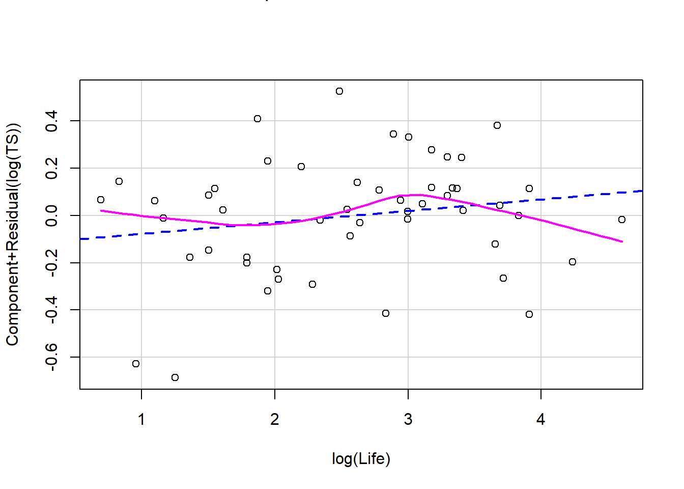
Partial residual plot of Life:But notice that the effect of log(Life) in the MLR model that adjusts for brain size, body size, gestational period and danger level shows a positive association with total sleep (holding other terms fixed)!
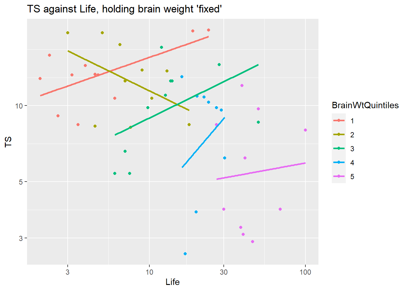
We can attempt to visualize why we have a negative trend in the scatterplot but a positive trend in the partial residual plot (and MLR estimated effect) with a coded scatterplot that “controls for” one of the model terms. Here we grouped cases together into 5 groups based on their value of BrainWt using the ntile function (and then turning these groups into a factor variable). So BrainWtQuintile number 1 contains all cases with brain weights in the lower 20% of all brain weights. When we group our cases into similar brain weight cases, we (roughly) are controlling for brain weight. Our least square trends between total sleep and life space are mostly positive within each group of similar brain weights (except for the second quintile brain weight group). This is the positive effect of life span on total sleep in our model that controls for brain weight (and other predictors).
sleep %>%
  mutate(BrainWtQuintiles = factor(ntile(BrainWt, n = 5))) %>%
  ggplot(aes(x = Life, y = TS, color = BrainWtQuintiles) )+
  geom_point() +
  geom_smooth(method = "lm", se = FALSE) +
  scale_x_log10() + scale_y_log10() +
  labs(title = "TS against Life, holding brain weight 'fixed'")
So why is the scatterplot of total sleep vs. life span negative? This is due to the correlation between the predictors and it really an example of Simpson’s paradox!
- The association between
LifeandBrainWtis positive - The negative effect of
BrainWtonTSis stronger than the effect ofLife. - As
Lifeincreases, so doesBrainWtand this increase inBrainWtcauses a decrease inTS. Since this effect is stronger than the positive effect ofLife, we see a decrease inTSasLifeincreases. (Notice that theBrainWtQuintilegroups trend down asLifegets bigger.)
3.9 Collinearity
As shown above with the total sleep example, predictors effects in a MLR model depend on which other predictors are contolled for in a model, especially when predictors are associated with one another. Associations between predictors can
- make it hard to “see” a predictors effect using EDA,
- make it difficult to interpret predictor effects since it is hard to “hold fixed” all other predictors if they are correlated,
- inflate our measures of SE which can make it difficult to identify statistically significant predictors.
Two predictor terms \(x_1\) and \(x_2\) are exactly collinear if for all cases \[ c_1 x_{1,i} + c_2 x_{2,i} = c \ \ \ \ \Rightarrow \ \ \ \ x_{1,i} = (c - c_2 x_{2,i})/c_1 \] where the \(c\)’s are fixed constants. For example, if \(x_1\) measures height in inches and \(x_2\) measures height in feet then these terms are exactly collinear and we can write \(x_1 = 12x_2\). We can this idea to more than two predictors: \[ c_1 x_{1,i} + c_2 x_{2,i} + \dotsm + c_p x_{p,i} = c \] We often don’t have exactly collinear term, but we can have approximately collinear terms if the linear combinations are approximately constant.
We can measure how linearly related predictors are in a model by measuring the \(R^2_i\) for the regression of \(x_i\) on all other predictors (ignoring the response right now). It turns out that the SE of our model parameters depends on this measure of predictor association. The estimated effect of predictor \(x_i\) has a SE of \[ SE(\hat{\beta}_i) = \dfrac{\hat{\sigma}}{\sqrt{(n-1)s^2_i}} \sqrt{\dfrac{1}{1-R^2_i}} \] Conclusion: This SE is smallest if \(x_i\) is not associated with other predictors (\(R^2_i \approx 0\)) and it grows larger the more correlated \(x_i\) is with other predictors.
A common measure of the collinearity of term \(x_i\) with all other terms is the variance inflation factor (VIF): \[ VIF_i = \dfrac{1}{1-R^2_i} \] If \(R^2_i = 0.5\), then \(VIF_i = 2\) meaning the SE is about \(\sqrt{2}=1.4\) times larger than it would be if \(x_i\) was not correlated with other terms. If \(R^2_i = 0.75\), then \(VIF_i = 4\) meaning the SE is about \(2\) times larger than it would be if \(x_i\) was not correlated with other terms. If \(R^2_i = 0.9\), then \(VIF_i = 10\) meaning the SE is about \(3.2\) times larger than it would be if \(x_i\) was not correlated with other terms.
3.9.1 Example: Sleep
Back to the total sleep example from 3.8.2 and the regression of total sleep on body weight, brain weight, life span, gestation period (in days) and danger level with all quantitative predictors logged:
##
## Call:
## lm(formula = log(TS) ~ log(BodyWt) + log(BrainWt) + danger +
##     log(Life) + log(GP), data = sleep)
##
## Coefficients:
##     (Intercept)      log(BodyWt)     log(BrainWt)        dangerlow
##         3.37184         -0.02768         -0.02285         -0.15528
##  dangermoderate       dangerhigh  dangervery high        log(Life)
##        -0.44160         -0.23741         -0.94277          0.04862
##         log(GP)
##        -0.20074
The car package contains the function vif that gives us the VIF values for this model:
##                   GVIF Df GVIF^(1/(2*Df))
## log(BodyWt)  15.033055  1        3.877248
## log(BrainWt) 21.604988  1        4.648117
## danger        1.676492  4        1.066719
## log(Life)     3.541828  1        1.881974
## log(GP)       3.037467  1        1.742833
Note that when we have a factor term (danger), the VIF’s are calculated as usual for quantitative terms but a generalized version (GVIF) is computed for factor terms by basically adding up the cumulative VIF across indicator variables for that factor.
Here we see that brain and body weight are highly correlated, mostly with one another when we revisit the scatterplot matrix shown in 3.8.2 (correlation betwee log(BodyWt) and log(BrainWt) is 0.959). This is a main reason that neither term is statistically significant when the other term is in the model, as shown by the t-test results:
| term | estimate | std.error | statistic | p.value | conf.low | conf.high |
|---|---|---|---|---|---|---|
| (Intercept) | 3.3718 | 0.2432 | 13.8641 | 0.0000 | 2.8810 | 3.8626 |
| log(BodyWt) | -0.0277 | 0.0457 | -0.6059 | 0.5479 | -0.1199 | 0.0645 |
| log(BrainWt) | -0.0229 | 0.0688 | -0.3323 | 0.7413 | -0.1616 | 0.1159 |
| dangerlow | -0.1553 | 0.1084 | -1.4328 | 0.1593 | -0.3740 | 0.0634 |
| dangermoderate | -0.4416 | 0.1281 | -3.4481 | 0.0013 | -0.7001 | -0.1831 |
| dangerhigh | -0.2374 | 0.1172 | -2.0259 | 0.0492 | -0.4739 | -0.0009 |
| dangervery high | -0.9428 | 0.1278 | -7.3791 | 0.0000 | -1.2006 | -0.6849 |
| log(Life) | 0.0486 | 0.0728 | 0.6678 | 0.5079 | -0.0983 | 0.1955 |
| log(GP) | -0.2007 | 0.0625 | -3.2121 | 0.0025 | -0.3269 | -0.0746 |
A good strategy with two highly collinear terms is to remove one of the two terms. Here we remove brain weight since it has the highest VIF and a higher p-value that body weight.
sleep_lm4 <- lm(log(TS) ~  log(BodyWt) +log(Life) + log(GP) + danger, data = sleep)
tidy(sleep_lm4, conf.int = TRUE)
## # A tibble: 8 × 7
## term estimate std.error statistic p.value conf.low conf.high
## <chr> <dbl> <dbl> <dbl> <dbl> <dbl> <dbl>
## 1 (Intercept) 3.38 0.239 14.1 9.00e-18 2.90 3.86
## 2 log(BodyWt) -0.0413 0.0202 -2.04 4.77e- 2 -0.0821 -0.000442
## 3 log(Life) 0.0371 0.0633 0.586 5.61e- 1 -0.0907 0.165
## 4 log(GP) -0.208 0.0578 -3.60 8.13e- 4 -0.325 -0.0916
## 5 dangerlow -0.162 0.106 -1.53 1.33e- 1 -0.375 0.0514
## 6 dangermoderate -0.444 0.127 -3.51 1.07e- 3 -0.699 -0.189
## 7 dangerhigh -0.237 0.116 -2.04 4.70e- 2 -0.471 -0.00325
## 8 dangervery high -0.938 0.125 -7.47 2.68e- 9 -1.19 -0.684## Analysis of Variance Table
##
## Response: log(TS)
## Df Sum Sq Mean Sq F value Pr(>F)
## log(BodyWt) 1 5.8426 5.8426 85.3002 9.105e-12 ***
## log(Life) 1 0.0234 0.0234 0.3418 0.5618
## log(GP) 1 1.5091 1.5091 22.0333 2.739e-05 ***
## danger 4 4.1709 1.0427 15.2234 7.879e-08 ***
## Residuals 43 2.9452 0.0685
## ---
## Signif. codes: 0 '***' 0.001 '**' 0.01 '*' 0.05 '.' 0.1 ' ' 1## # A tibble: 1 × 12
## r.squared adj.r.squared sigma statistic p.value df logLik AIC BIC
## <dbl> <dbl> <dbl> <dbl> <dbl> <dbl> <dbl> <dbl> <dbl>
## 1 0.797 0.764 0.262 24.1 6.05e-13 7 0.351 17.3 34.7
## # ℹ 3 more variables: deviance <dbl>, df.residual <int>, nobs <int>## GVIF Df GVIF^(1/(2*Df))
## log(BodyWt) 3.012225 1 1.735576
## log(Life) 2.738637 1 1.654883
## log(GP) 2.651420 1 1.628318
## danger 1.567496 4 1.057793Now all but life span is statistically significant and VIF is greatly reduce. There are danger levels that don’t have statistically significant effects based on the t-tests, but that is saying that a level is not different from the baseline very low danger level. The insignificant dangerlow coefficient tells us that we don’t have evidence that the mean total sleep of very low and low danger levels are different, after controlling for body weight, life space and gestational period. Overall, the anova results, with danger last, tell us that danger level is statistically significant after controlling for the predictors above it in the table. This means at least one danger level is different from the rest.
Our fourth model does include Life which isn’t very significant after accounting for other predictors (p-value = 0.165). If we remove it, all terms are statistically significant or almost statistically significant at the 5% level. The R-squared of our biggest model (lm3) is 79.7% and the R-squared of this smaller model is 79.5%, so eliminating brain weight and life span provides a model with similar explanatory power as the larger model. And the adjusted R-squared of the smaller model is larger (0.767 vs. 0.759).
sleep_lm5 <- lm(log(TS) ~  log(BodyWt) + log(GP) + danger, data = sleep)
tidy(sleep_lm5, conf.int = TRUE)
## # A tibble: 7 × 7
## term estimate std.error statistic p.value conf.low conf.high
## <chr> <dbl> <dbl> <dbl> <dbl> <dbl> <dbl>
## 1 (Intercept) 3.43 0.223 15.3 2.83e-19 2.98 3.88
## 2 log(BodyWt) -0.0363 0.0183 -1.99 5.30e- 2 -0.0732 0.000492
## 3 log(GP) -0.197 0.0539 -3.65 6.99e- 4 -0.305 -0.0880
## 4 dangerlow -0.171 0.104 -1.65 1.05e- 1 -0.380 0.0374
## 5 dangermoderate -0.472 0.116 -4.07 1.91e- 4 -0.706 -0.239
## 6 dangerhigh -0.247 0.114 -2.17 3.53e- 2 -0.477 -0.0178
## 7 dangervery high -0.944 0.124 -7.61 1.48e- 9 -1.19 -0.694## Analysis of Variance Table
##
## Response: log(TS)
## Df Sum Sq Mean Sq F value Pr(>F)
## log(BodyWt) 1 5.8426 5.8426 86.593 5.861e-12 ***
## log(GP) 1 1.2832 1.2832 19.018 7.691e-05 ***
## danger 4 4.3968 1.0992 16.291 2.940e-08 ***
## Residuals 44 2.9687 0.0675
## ---
## Signif. codes: 0 '***' 0.001 '**' 0.01 '*' 0.05 '.' 0.1 ' ' 1## # A tibble: 1 × 12
## r.squared adj.r.squared sigma statistic p.value df logLik AIC BIC
## <dbl> <dbl> <dbl> <dbl> <dbl> <dbl> <dbl> <dbl> <dbl>
## 1 0.795 0.767 0.260 28.5 1.27e-13 6 0.148 15.7 31.2
## # ℹ 3 more variables: deviance <dbl>, df.residual <int>, nobs <int>## # A tibble: 1 × 2
## r.squared adj.r.squared
## <dbl> <dbl>
## 1 0.797 0.759## GVIF Df GVIF^(1/(2*Df))
## log(BodyWt) 2.492514 1 1.578770
## log(GP) 2.343308 1 1.530787
## danger 1.335724 4 1.036847